One shape, losing detail
A storm made of one repeated hook, and a very small mountain
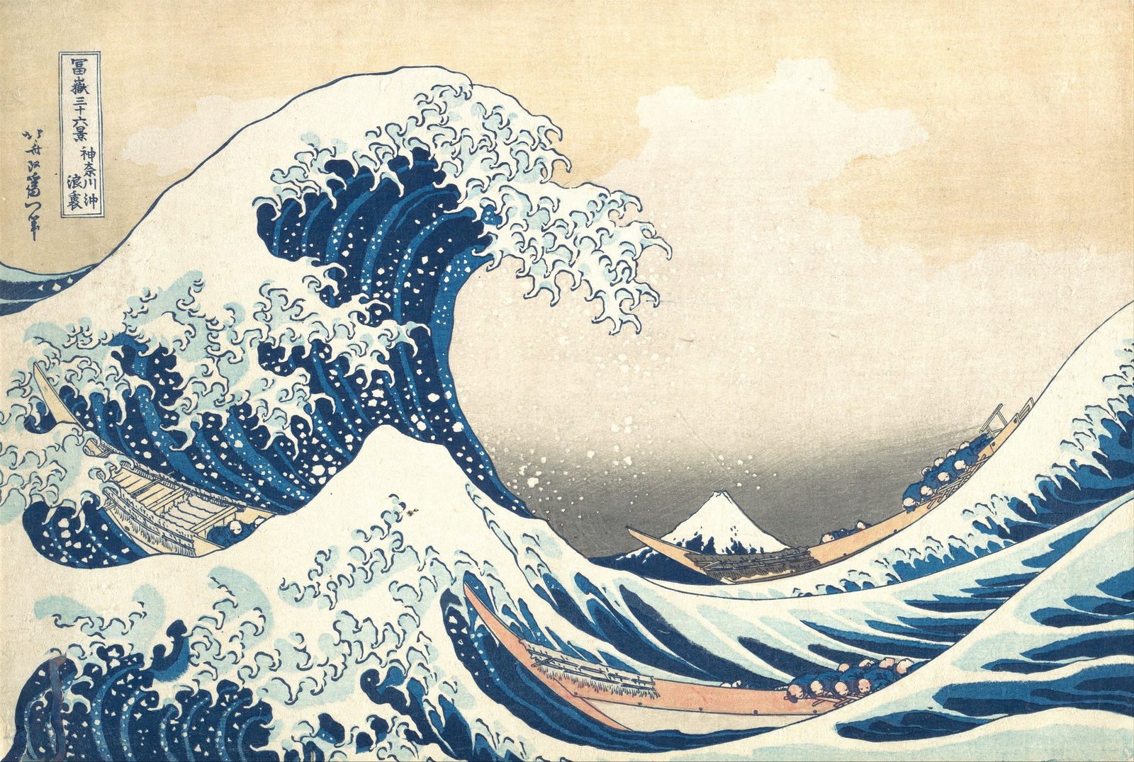
- Artist
- Katsushika Hokusai
- Title
- Under the Wave off Kanagawa (Kanagawa oki nami ura), also known as The Great Wave, from the series Thirty-six Views of Mount Fuji (Fugaku sanjūrokkei)
- Date
- ca. 1830–32
- Medium
- Woodblock print; ink and color on paper
- Image
- Public domain (CC0)
Open in Simple Art
Watch this story on iPhone and iPad, with offline downloads and a painting every day.
About 3 minutes of looking, in 10 parts.
Under the Wave off Kanagawa
There is not one blended edge in this picture, and no shading, light source or modelling. Every shape is flat colour inside a drawn line, and the wave is still terrifying.
Hokusai, about 1831
A woodblock print from the series Thirty-six Views of Mount Fuji. The blues are Prussian blue, which reached Japan in quantity from 1829 and was known there as Berlin indigo, printed together with traditional indigo.
A spiral, and a joke
The design is a great spiral. The wave rises at the left, curls over the top, and its foam sweeps right and down, delivering you to Mount Fuji, which is tiny. That is the trick of the picture, and it is as much a joke as a device.
One hook, repeated
The crest is a swarm of one invented shape, a hook that curls back on itself, printed as an outline and filled flat, with no shading. The white flecks in the dark blue below are places where the paper was simply left bare.
Two blues and a line
This is the whole technical vocabulary: a deep navy, a mid blue, a printed contour between them, and no gradient inside either. With that he describes several tons of moving water.
The motif simplifies
I expected the far wave to use the same hook, only smaller. The hook is gone, and what is left are blunt, comb-like teeth. As the motif recedes, Hokusai strips detail out of it instead of shrinking it faithfully.
The third size
In the near trough the hook is back, intact, at a size between the two. So the motif comes as a graded family: full detail close, less further out, gone at distance. That is aerial perspective done with drawing instead of atmosphere.
The one soft passage
The sky behind Fuji is the single exception. It moves from cream to grey with no line at all, wiped onto the block by hand before each impression. In a picture where every boundary is drawn, he breaks the rule once, and spends it on distance.
Fuji, made small
The sacred mountain is small enough to sit under a boat. The blue shapes along its snowline are miniature versions of the shapes used for the wave, so the mountain is made of the same marks as the thing about to swallow it.
The crews
The rowers are barely there: a pale round hat over a hunched blue back, repeated shoulder to shoulder. Each one is almost nothing, and together they read instantly as a crew flattened against the water.
Look closer
8 details, each checked against a close-up of the picture.
-
the breaking crest
The foam at the crest breaks into repeated claw-shaped tendrils, each one drawn with a dark contour and filled flat white, with no shading inside it.
The crest's foam is a swarm of one shape: a hook that curls back on itself, printed as a dark contour with a flat fill inside. Nothing is shaded. Already inside this crop the hooks come at two clear sizes, the big ones riding the crest and a shoal of smaller ones trailing to the right. Most are filled with a pale blue-grey rather than pure white, which keeps them sitting behind the true whites. In the dark blue body below, small diamonds and wedges have simply been left unprinted to read as flying spray.
-
Mount Fuji
Mount Fuji is very small, sits low on the horizon, and is drawn with exactly the same outline-and-flat-fill method as the foam above it.
Fuji is small, low, and drawn with exactly the same vocabulary as the water: an outline and a flat fill. The blue shapes scattered along its snowline are miniature versions of the dark blue shapes used for the wave, so the mountain is literally made of the same marks as the thing threatening to swallow it. A boat cuts across its base. The graded grey sky sits behind, speckled with age spots.
-
flat blue wave body
The body of the wave is flat areas of two different blues separated by contour lines, with no gradient or modelling inside any of them.
Two blues, a deep navy and a mid blue, laid as flat areas with a printed contour between them and absolutely no gradient inside either. A third, paler blue sits under the foam. White diamonds and wedges are left unprinted inside the navy. That is the entire technical vocabulary for describing a mass of moving water, and it is completely sufficient.
-
rowers in the near boat
The rowers are a row of near-identical small shapes clinging along the hull, each described with only a few printed strokes.
The rowers are a row of near-identical small shapes, each one a pale round hat over a hunched blue back, packed shoulder to shoulder along the gunwale. Individually they are almost nothing - two shapes and a couple of lines. Collectively they read instantly as a crew straining flat against the water. Their oars make a hatched fringe along the hull.
-
the graded sky
Behind Fuji the sky darkens through a smooth grey band; it is the only graded tone in the print, everything else being flat.
The sky moves smoothly from pale cream at the top to a definite grey at the horizon, with no contour line anywhere in the transition. In a print where every other boundary is a drawn line, this one graded band is conspicuous, and it is spent on exactly the place that needs to feel like distance. The right-hand boat sits in this crop too, its rowers reading clearly as pale round hats over blue backs.
-
foam claws, right wave
The right-hand wave's edge is a row of the same claw motif as the crest, printed at a distinctly smaller scale.
This is where my first reading was wrong, and the correction is the more interesting fact. The foam on this wave is not the crest's claw shrunk down: it is a SIMPLER shape - blunt, angular, comb-like teeth with the curling hook removed entirely. So as the motif gets smaller Hokusai does not just scale it, he strips detail out of it. The result is that the eye reads the far water as the same substance without the near water losing its dominance.
-
foam claws, foreground trough
In the foreground trough the same claw motif appears a third time, smaller again, along the near edge of the water.
The claw appears a third time here in the foreground trough, smaller than the crest but with its curling hook intact - unlike the simplified teeth of the far wave. So the three appearances are not one shape at three sizes but a graded family: full hook near and large, hook retained but smaller here, hook dropped entirely at distance. The same unprinted white spray shapes and pale blue underlayer recur.
-
title cartouche and signature
A ruled cartouche of kanji giving the series and title sits at the upper left, with the artist's signature printed below it, both inside the picture area.
A ruled rectangular cartouche holds the series title and the print's title in kanji, and the artist's signature runs vertically to its left. Both sit inside the picture area, on paper that has toned to a warm cream and picked up brown foxing spots. The cartouche is a hard-edged rectangle in a design that otherwise has almost no straight lines.
Behind the Great Wave
An old man starting again
Katsushika Hokusai was born in Edo, the city now called Tokyo, in 1760 and died there in 1849 [1]. The Thirty-six Views of Mount Fuji were produced from about 1830 to 1832, when he was in his seventies [6].
The years just before had been hard. According to Wikipedia's account of the print, he ran into financial difficulty in 1826, probably suffered a stroke in 1827, lost his wife in 1828, and in 1829 had to rescue his grandson from money troubles, which pushed him into poverty [5].
He changed his artist's name many times, using more than thirty over his career [5]. The Met's impression is signed Zen Hokusai Iitsu hitsu, pairing the famous name with Iitsu, the name he had more recently taken [1][5].
A publisher's bet on a new blue
Prints like this were commercial ventures. Each one needed four specialists: a designer, a carver, a printer and a publisher, and it was usually the publisher who conceived the project, chose the theme and set the standard of quality [3]. The design was pasted onto a block, usually of cherry wood, with a separate block cut for each colour, and printed by hand on paper made from mulberry bark [3].
Hokusai's publisher was Nishimuraya Yohachi, whose firm traded as Eijudō [5]. Just in time for the New Year festivities of 1831, the firm advertised the series, and its selling point was an imported pigment newly available to printmakers: Prussian blue [2].
The series sold well enough to grow. Ten further designs were added, taking it to forty-six, although the publisher had at one stage planned more than a hundred [5][6].
Printers nobody named
Scientific study at The Met has shown how much the workshop contributed. The printers didn't simply swap the traditional indigo for Prussian blue. Instead, they mixed the two for the outlines and printed one pigment over the other, deepening the blue without dulling it [2].
Marco Leona, the scientist who led that work, thinks The Met's sheet was probably one of the earliest impressions printed. He points out that Hokusai was only one of the artists involved, though he's the only one whose name we know [2].
A set of blocks could yield thousands of impressions before the carving wore down [3]. For this design, one estimate puts the first run at about 1,000 copies and the eventual total at around 8,000. As of 2022, 113 first-edition impressions were known to survive, 35 of them in American museums [5].
Across the sea to Europe
Hokusai found a European following after the 1853 treaty that opened trade between Japan and the West, and Impressionists such as Monet owned his prints [4]. As early as 1866, the critic Philippe Burty compared him with Watteau, Goya and Delacroix [4]. Van Gogh, another admirer, praised the drawing and the use of line in this print [5].
Claude Debussy kept a framed impression on his studio wall, and a cropped detail of the wave appeared on the cover of the first edition of La Mer, published by Durand in 1905 [4]. The Met adds that the print is said to have inspired Rilke's Der Berg (The Mountain) as well [1].
How The Met's copy arrived
This impression belonged to Louisine Havemeyer of New York and came to the museum through her bequest in 1929, as part of the H. O. Havemeyer Collection [1]. It has since been lent to exhibitions that include the Royal Academy's Hokusai show in London from 1991 to 1992 and the Freer and Sackler Galleries' exhibition Hokusai: Thirty-Six Views of Mount Fuji in Washington in 2012 [1].
When this was written, the museum's website listed the print as not on view [1]. Outside museums, an impression of the design sold in 2023 for US$2.8 million, a record price for the print [5].
- Under the Wave off Kanagawa (Kanagawa oki nami ura), also known as The Great Wave (object record JP1847) . The Metropolitan Museum of Art
- The Great Wave: Anatomy of an Icon (Marco Leona, 2020) . The Metropolitan Museum of Art
- Woodblock Prints in the Ukiyo-e Style (Heilbrunn Timeline of Art History) . The Metropolitan Museum of Art
- Hokusai and Debussy's Evocations of the Sea (Michael Cirigliano II, 2014) . The Metropolitan Museum of Art
- The Great Wave off Kanagawa . Wikipedia
- Thirty-six Views of Mount Fuji . Wikipedia