Art Bootcamp Notes · 08 · Gesture and space
Positive and Negative Space in Drawing: Value, Shadows and Edges
What negative space is, how value makes an object stand out, the parts of light and shadow on a sphere, and how the background controls which edges are seen.
 By LIPAI WANG · Chapter 8 of his book Art Is a Puzzle You Can Solve
Before we dive deeper into still life, I want to talk about two concepts. One is called positive space; the other is negative space. Whatever you’re drawing, a person, an apple, a hand, a chair, a character, that thing is the positive space. It’s common practice to pay attention to the positive space. But you also need to pay attention to the other thing, the thing that isn’t there: everything around your subject. That’s the negative space.
A lot of people ignore the negative space. They think that if they draw the positive space, everything is fine. But here’s the trick: the negative space is not empty. In this chapter we’ll use value to make the two work together, and to understand value properly we’ll take a long detour through light and shadow on a simple sphere. Then we’ll come back to the negative space and see how much power it gives you over where the viewer looks.
Two kinds of space
The thing you actively draw is the positive space. The thing you’re not touching, not drawing, is the negative space. Here’s a way to see it. Imagine horizontal lines running across the page towards your subject, and notice where each one touches it. Everything those lines cross before they reach the subject, everything around it and underneath it, is the negative space.
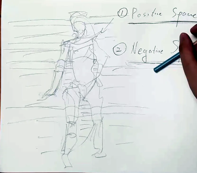
The negative space can have value. It can have shape, angles and form. It also has proportions, and those proportions help guide the viewer. So while you draw, don’t focus purely on the positive space and leave it at that. Actively think about the negative space as well.
Value makes the object stand out
Earlier, we used gesture to get the shape down quickly, and then form lines and cross-contours over it, so that it became more 3D-ish. We can combine those methods with this new idea, because lines and cross-contours alone are not enough. We need to add value: the difference between light and dark.
Take a fruit, for example, with a few dots on it. You can quickly get the shape, then add a cross-contour, tilted this way. But that does not make the object stand out, because all you’ve got is the positive space. You can make it more interesting by adding some negative space, using value.
- Use contrast. Keep the object bright, and make whatever is behind it a little dark.
- If the background is really far away, you can make it even darker.
- Now the positive space and the negative space are clearly distinguished. The object stands out, and it’s more 3D-ish and more realistic than a thing that’s just sitting there on the page. It’s brought forward.
You can also do the complete opposite. Get the shape ready, then make the object itself dark. I’m not adding any light-and-shadow relationship yet; I just want you to pay attention to the spaces. Then add negative space to it: a table, say, which I make not so dark, with the darkest part close and the part farther away quite bright, so the table has just a tiny bit of tilted darkness. The rest is the background. Add a little cross-contour, and you’ve got contrast between positive and negative space. Instantly it becomes better. You could add some shadow underneath too, but we’ll talk about shadows later.
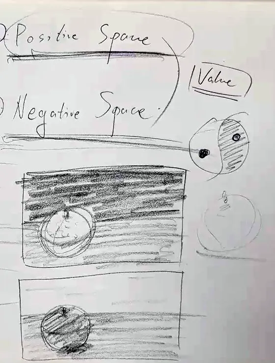
Either way, it’s better than focusing purely on the positive space. The object stands out precisely because you didn’t only focus on the positive space. You focused on the negative space as well, and used value to control the contrast between them.
It’s just like yin and yang from ancient China: dark and light, and inside the black there’s whiteness, and inside the white there’s blackness. Positive and negative space work like that.
Try it. Draw a simple fruit twice. In the first drawing keep the fruit bright and darken the background behind it. In the second make the fruit dark and give it a lighter table and background (Figure 11.2).
The graphic footprint
When you’re doing actual work, character design, for example, there’s a concept called the graphic footprint. I know it sounds fancy. It’s nothing like a carbon footprint. It means that when you draw something, you need to make it instantly recognisable, like a stamp, like a logo. That’s why it matters how you use the contrast of positive and negative space, and the difference in value: to get this graphic footprint quickly.
Let me give you an example. I don’t know whether you watch anime, but there’s a Pokémon cartoon, and in between it shows kids only the silhouette of a Pokémon and asks, “Who am I?” The kids try to guess the character, and then: it’s Pikachu.
So the object, the positive space, is made really black. It becomes a silhouette, an icon of the thing, and the rest is the negative space. When you draw, you tend to want something like this, as if you were drawing that silhouette for “Who am I?” That’s also a very good method for character design. When you design your own original character, imagine a light shining just behind it so that all you get is the silhouette, and make that silhouette very, very recognisable. Of course there can be tricky cases: maybe it turns out to be two rabbits hugging, and that thing is a balloon. But while you’re designing, you can use the graphic footprint: positive space, negative space, and the positive space stands out, like a stamp on a table. A lot of drawings start with the silhouette as well.
One colour, many values
Remember, we’re only using one colour here: black. And black has fifty shades of grey. This is really dark; then you can make it a little less dark, and less, and less, step by step. You don’t even need a continuous stroke; you can use multiple strokes. So even with a single colour you can play around with the value, not just positive and negative. Positive and negative are opposites, and it can go either way, depending on what you want to put in the positive space and what you put in the negative.
So those are the fundamentals I have just talked about: using the gesture, using positive and negative space, and using different values (dark, midtone, the local colour and the background), and using that contrast to make the subject stand out.
That’s a quick tool if you want to design a character or do a storybook. But I also want you to understand why value happens, and the reason is really, really simple. We see things because a light source hits the object, and that light is reflected back to our eyes. That happens for a reason, and we can follow it. Later I’m going to show you how to break that rule, because art is above life. You don’t have to treat it like a physics lesson and follow every light source. You can intentionally change the colour, tilt it a little, make it lighter or darker. But first I want you to understand why the value changes.
All these terms they teach, graphic footprint, positive space, negative space, gesture, contour, shading, are like learning a language. English is not my first language. You can learn a language by immersing yourself in it and picking things up naturally, or you can learn it the scientific way, through the grammar. What art school teaches you is a kind of grammar. People studied a lot of great artists, learnt from them, found some common ground, and wrote down the grammar of that language. Of course it doesn’t cover everything; there are exceptions, because that’s how language evolves, and that’s how art evolves. So the rules may not be enough, but they’re a quick, methodical way to understand problems. We’ll keep coming back to them.
Setting up: the light source and the sphere
So let’s go deeper into positive and negative space by adding the reason behind value: light and shadow.
- Decide where the light comes from. Say it comes from this side. Then decide whether it’s coming towards you or going away from you, because that matters: it tells you whether the light is shining from behind the object or in front of it, and that changes the light and all the bouncing. I mark it with a small symbol for the light: a few parallel lines for the rays and a cone, and the way I draw the open end of the cone shows whether the light is coming towards you or going away.
- Lay in a circle. Use your shoulder to get the circle. It doesn’t have to be perfect; gradually lay it in until you get approximately a circle. That’s enough. If this is what you want to draw, it’s your positive space. The rest of it, don’t worry; we’ll solve that problem, like a maths problem. You could make it non-symmetrical, a pear for example, but let’s start with this very simple one.
- Think of value as a scale. At every step I’m still going to ask you: what’s the positive space, and what’s the negative space? That way you always know what we’re doing. But now we add difficulty. Instead of just three values, really light, middle and really dark, think of a scale: zero, one, two, three, four, all the way to nine or ten. You choose different values and put them inside the shape.
Cast shadow
If there’s an object, it must be standing on something. Normally I’d draw a table, a horizontal line, but I don’t want to confuse you. There’s an object, it sits on a surface, and there’s a light, so obviously there’s a shadow below it. Everybody calls that the cast shadow. Surface, object, light source: you get a cast shadow. And if there’s a cast shadow, it must be darker, so the value changes.
The cast shadow is the direct shadow of the object, so it has very hard edges. I give it a clear cut of edges: light comes from here, and boom, the shadow goes down. Its value is maybe eight or nine.
The ball still looks a bit flat. Remember the negative space? I can use a cross-contour: imagine a line around the ball, and then back, vanishing all the way into the negative space. That gives you so much more of a 3D feeling. Make the cast shadow bigger if you like, with a clear surface and a clear contact area. I’m not worried yet about what happens inside the ball, only about the edges of that shadow.
Finding where the shadow turns
Why didn’t I go straight to shading the sphere? Because it’s more complicated than adding a shadow and a highlight. The light hits the surface underneath and reflects back up into the shadow, and that reflected light interferes with it. So here’s my trick: I draw the cast shadow first, because it exists and it’s dark, and then I think about the direction of the light.
I used horizontal cross-contours earlier, as I showed you in the gesture lessons, and it’s very tempting to think the shadow on the ball follows them. It does not. Remember, you’ve got a cast shadow, so your mind does a basic computation: the light shines this way. And it’s not just one ray but many, like arrows all shooting down in the same direction. That’s why we got the cast shadow. So forget the horizontal lines. Look at where the light comes from, and draw the cross-contour that follows it.
That’s the major hurdle. Find the direction of the light. Where it hits directly is the lit part; then there’s an in-between part; and below that is a part the light can’t reach, because it’s a sphere, like the earth. The angle keeps changing: a direct hit, then less direct, less direct, until the light only grazes the surface like a tangent and shoots past. It can’t turn round and hit the underside. It can only hit the ground and bounce back up. So there’s a cutting point, a line where light turns to shadow, and it is not horizontal: you need to rotate it a little, towards the light.
Core shadow
Where you reach that turning area, there should be a shadow. That’s called the core shadow: the turning point.
- Lay in the core shadow along the rotated line. If you want some force, push it forward a little; if you don’t, keep it away and make it fuzzy. Add more value below and less above.
- I’d already drawn a line there. To make a line disappear, keep adding value up to it until it vanishes.
- Even better, go over the whole area gently, so it’s not so flat, and gradually make the area a little bigger.
- If you can still see a hard cut, use the smudging tool, a paper stump, and do just a tiny bit. You’ll get a loose texture; it can even look watery, as if you’re painting watercolour. But don’t overdo it. I want a cleaner result, so I make the edges not so fuzzy, especially along this line.
I made tons of lines when I wasn’t sure about the circle; you can blend all of those in. But don’t overdo the blending, because we’re still talking about positive and negative space and we haven’t finished with that. I just blend the really hard-looking darkness so it’s not so intrusive, and smooth the charcoal texture so it reads as one thing.
If the cast shadow is eight or nine, the core shadow is approximately five, maybe six. So that’s two down: the cast shadow with clear edges, and the core shadow in between. As the form turns away, you add a little shadow. That’s the sphere: a smooth transition.
Reflected light
You might wonder why I left the area below the core shadow blank. You might think the core shadow should be the darkest, most fundamental shadow on the object. But as I said, the light hits the table and bounces back up. That’s reflected light. It’s not as strong as the direct light, but it exists, so you can’t draw total darkness there.
How do you do it? I’ve already used the smudging tool, so it’s carrying charcoal. If you draw directly with the pencil, it’ll be darker than you want, even with a tiny bit. So:
- Brush gently, without making every line overlap. Leave a little space between the strokes, as if you were doing make-up: put the colour on, then blend it out.
- Use what’s already on the smudging tool to blend it. Test a little, because if you press too hard, it can end up darker than what was there.
- Ease it in, until the reflected light sits a little lighter than the core shadow.
- Use the eraser to get the edges back. You can shape the eraser into any shape and draw with it.
If the cast shadow is eight or nine and the core shadow five, six or maybe seven, the reflected light is turned down a little: four, five, six. The order of things does matter, but don’t worry too much while you blend, because you can draw the hard edges back in with the eraser. Not every edge needs to be sharply cut, either; we’re going to talk about blending edges in and making them vanish. If a line you drew is too much, make it disappear. And if you think the core shadow isn’t dark enough, add a tiny bit more. There are tons of ways to do this. I’m just showing you that you don’t have to build it with one continuous stroke after another. You can get away with fewer strokes and use blending.
Even with this boring shape, keep everything flowing. It’s not gesture drawing of a person, but it’s still gesture, because everything needs to flow.
Occlusion shadow
We can still push down into the place where the ball meets the ground. That’s the occlusion shadow. Look at anything in real life and you’ll find it. When two objects get very close, light can’t get in; through all the reflecting, its energy just dies out. Every little crease, like the folds of the skin on my hand, has a dark shadow, even when the light comes from above and hits my hand directly. That’s occlusion shadow.
It should be really dark, darker than the cast shadow or the core shadow: the darkest part of all, nearly nine or ten. So instead of blending everything, I make it clearly stand out, because this is where the ball and the ground connect. The edge there can hardly be seen, but I stress it, because it’s important. Add some force to make the connection really connected, and push it down into the ground a little as well.
You want it more defined than blended. You can blend to get rid of the texture, but don’t let it get lighter. Everywhere things connect, you should get a really dark shadow with a defined edge. Then you can blend out towards the reflected light. But reflected light, core shadow, cast shadow and occlusion shadow should each be clearly distinct, so if this part won’t blend into a gradual change, that’s okay; it’s not supposed to. If the edges look too strong, don’t worry: we’ll blend them into the background in the end. If you rank them by value, darkest first: occlusion shadow, cast shadow, core shadow.
The terminator and the halftone
Everything below is in good shape, so let’s go up. Up here you don’t need to draw much with the pencil: there’s already plenty of charcoal around, and if you smudge it, it gets really dark. Use the eraser instead: with it I draw the colour of nothing, white, on the top of the ball. The tip of my smudging tool is now full of charcoal, so you can’t use it like that. You can rotate it a little, or rub it anywhere else to get the charcoal out; I rub it on the background beside the ball, and that gives me a background colour. I go over the area gently to smudge everything, because I don’t want this continuous line to break the smooth feeling.
You can see there’s no shadow up here, and you can see the little line where the shadow begins. That line is called the terminator: where the light stops and the shadow begins.
If you leave lines for a few hours, they can become really hard to smudge. Don’t just erase them. Use an up-and-down movement with the eraser. Erasing outright gives you clear white. The up-and-down movement only makes the area lighter, which is what I want here: not completely white, but not as dark as the core shadow, occlusion shadow, cast shadow or reflected light. I still want some charcoal on it.
So what is this area, not so bright and not so dark? It keeps something of the original colour of the object, but light adds whiteness to it, so it’s bright enough. It’s half of the tone; as the name suggests, it’s the halftone. You take the original tone and halve it, because it’s strongly influenced by the light.
I want you to remember this “half”, because the colour of an object is not just the colour of the object. It’s the colour of the object plus the environment. The other half is the light. Even though we haven’t added colour here, the light source’s colour and the object’s own colour are half and half. If you draw a red sphere, it isn’t necessarily exactly red; it’s a halftone of that red, and you need to consider the other half, the light. The two combined give the whole, true tone. If the light tilts cold, towards blue, the red tilts towards blue and purple. You can be more creative than that, but understand that it’s affected by the other half.
Light area, centre light and highlight
The halftone is the transition value between light and shadow. The terminator is where the light ends and the shadow begins, and above the halftone is the light. The light source can be the sun, or sunshine reflected off trees, mountains and clouds. So what’s the difference between direct light, centre light and highlight?
Every part that the light hits directly is lit. I prefer to call that the light area rather than “direct light”, because it’s an area: wherever the light shines on it, that’s still the light area.
Within the light area, where the light hits the surface perpendicularly, at ninety degrees, is the brightest part. That’s the centre light, the lightest area of the whole light area. I rotate the eraser and really erase it, because it should be really, really bright.
The highlight is different. It’s about where your eyes are. When you look at an object from a different angle, the highlight moves. It’s often dotted, because surfaces aren’t perfectly even, so a tiny dot shines at you. The highlight is not necessarily where the light hits perpendicularly. It’s where the light hits the object at the precise angle that reflects it straight back into your eyes. That’s why it’s person-dependent: it depends on where you stand, the light source and the object. From where I’m standing, the highlight is about here, so I add a little.
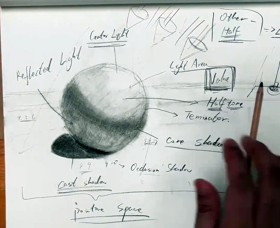
You can hardly see the difference right now, because the halftone is so light, but you get the idea: the light area, the centre light (the lightest part, where the light hits at ninety degrees), and the highlight, which depends on you.
All of this is playing with value. But remember: all of it is the positive space. I drew tons of labels around it, and everything looks fancy, but I paid no attention to the negative space. I focused too much on the object at hand. So let’s deal with that.
Bringing the negative space back
We’ve worried too much about the positive space. If you draw this sphere, it should be on a canvas. So I add a frame around it, tilted a little to the left for the composition. Don’t worry about all the labels inside it; they don’t matter. Now the canvas has negative space, and we’ve paid it no attention.
So decide how strongly you want the object to stand out. We’re still playing with value, but now between the main subject, the positive space, and the nothingness around it. Mathematically: on our value table of zero to ten, the whole object runs from about four to ten. Its lowest number is four, its highest is ten.
If you want it to stand out strongly, keep the background value low, but give it a little: just haze it, maybe one or two. Even a continuous line as a background makes everything make sense, because the object isn’t floating in vagueness. You don’t want your object floating in space.
That background automatically triggers your primal brain. We all have a monkey brain; some parts can’t be trained, because they’re embedded in instinct. I’m a programmer as well, so I think of it as an embedded algorithm: add a tiny bit of value as a background and your brain calculates everything automatically.
If you want it to be more subtle, increase the background value close to four, or even three.
- Keep adding force. You can use your thumb. Add more frequent lines, and more force.
- Watch it become more expressive than the positive space alone. With more negative space, it becomes a more finished drawing, a more finished piece of art.
While you learn to draw, you must get rid of the fear that you’re going to break it. You won’t. All this is just a tool, your playground. You can’t break art; you can only create art and practise art. You can’t break beauty. So just be brave.
Overlapping values: making edges disappear
Now the two values are already quite similar. Here’s what you can play with. If the positive space runs four, five, six, seven, eight, nine, ten, and the negative space runs zero, one, two, three, then right now you can still see a clear distinction. But you can bring the negative space up to three, or three and a half, or four, so that the two ranges overlap at four.
When they overlap, you can use that to make the edges softer and softer, until they finally disappear. Say you want this edge to go. It’s already disappearing. I just do a tiny bit and smudge it with the smudging tool, and the edge is gone. I smudge the lines so they’re not so granular, and you can see the background blending with the object. As I push the value of the negative space, the edge becomes softer and softer and disappears, as if it blends into the background, maybe because it’s now exactly the same value. All these edges that seemed so sharp become soft, because you played with the positive and negative space together. There’s no line there any more, no definition.
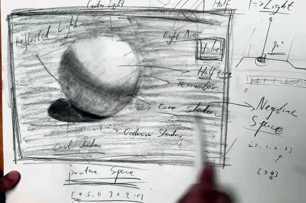
And that’s how you guide the viewer. Where the values are really similar and the edge is blurred, it stands out less. At first glance my eye can’t possibly go there. It’s guided to where there’s a clear definition, because there’s a value difference: the contact shadow, the occlusion shadow and the cast shadow, which have form and definite edges. From there I go to the core shadow, which has some form, and then up to where the ball blends into the background. You’re telling a story with value, and you’re telling it not just by focusing on the positive space, the object you draw, but by using the negative space and playing with its value. That’s how you guide the viewer through the whole image.
An experiment: raising the background
Let’s have a bit of fun and play with the value some more. I want to broaden your mind. Remember I said not to worry about all the labels? They have a value too.
So I raise the bar of the negative space: four, five, then push it to six, seven, eight. Watch the labels disappear. Watch how edges that were blurred and fuzzy reappear, and how the shadows become fuzzy. Fuzzy, disappearing edges reappear, like magic, and the defined edges disappear as if they never existed. Even the labels disappear. The fuzzy edges become prominent, as clearly defined as if you’d drawn the edge on purpose. I cheat a little by adding a bit of edge, then use the smudging tool, the magic brush, to make it look natural, and I put the highlight back.
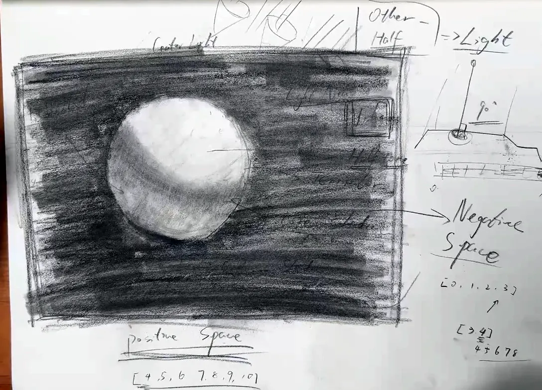
Clear-cut edges. The ball’s edge is redefined. And the very prominent cast shadow? It has disappeared into the negative space, and so have the labels. The value of the negative space just takes over.
Negative space doesn’t necessarily mean a lower value than the positive space. What matters is enough value difference. If there’s a big contrast, the edge becomes hard. If there’s no contrast or very little, it becomes a soft edge or a lost edge. Here, the cast shadow has become a lost edge.
You might think: does this really happen in real life? It does. Put the ball on a really dark table with a pure light shining on it. The cast shadow is absorbed by the dark surface material, there’s nearly no reflected light, and you just see the shadow on the object itself. So I’m not making things up. I want to show you how to think outside the box: not just draw the main thing, the positive space, the object, and stop worrying. Play with the value and pay attention to the negative space, so you can make the positive space stand out and guide the viewer. The viewer goes first to the biggest contrast, then on from there, and then this part vanishes.
Exactly the same object, but by playing with the negative space you can completely change the order in which people look at it. Before, the eye went to the bottom, where there was a big, defined contrast, and the top had lost edges. Now the top is prominent and the bottom disappears.
That’s why I wanted to show this with a scientific method. When critics and commentators say an artist “guides you there”, they aren’t inventing jargon or making things difficult. They’re telling the truth. I hope this method of mine helps you understand the concept, broadens your mind, relaxes you when you create, and makes you pay attention to areas you may not have noticed before.
Try it. Draw a sphere and take it through each stage in this chapter: cast shadow, core shadow, reflected light, occlusion shadow, then the halftone, centre light and highlight. Then frame it and tone the negative space, first lightly (one or two), then up to the object’s lowest value so some edges disappear, and finally much darker, and watch where your eye goes first each time.
Key takeaways
- The thing you draw is the positive space; everything around it is the negative space. The negative space is not empty. It has value, shape and proportions that guide the viewer.
- Lines and cross-contours alone aren’t enough. Use value contrast between the object and the space around it to make the object stand out.
- A graphic footprint is a shape that reads instantly, like a stamp or a silhouette. Design characters so their silhouette is recognisable.
- On a sphere: the cast shadow has hard edges (about 8–9), the core shadow sits at the turning point (5–6), reflected light is lighter (4–6), and the occlusion shadow where things touch is the darkest (9–10). The halftone is the object’s colour plus the other half, the light.
- When the value ranges of the positive and negative space overlap, edges soften and disappear. Where values differ strongly, edges stay hard. That’s how you choose where the viewer looks.
- You can’t break art; you can only create it. Be brave.
LIPAI WANG
A self-taught artist and teacher, known to his video students as William Jiamin. A former programmer, he teaches drawing, painting, pixel art and 3D the way he learned them: one solvable piece at a time.