Art Bootcamp Notes · 07 · Light, shadow and form
How to Draw a Plaster Cast Head: Five Stages from Lay-In to Darks
My five-stage method for a plaster cast head in pencil: outline, lay-in, one flat shadow tone, midtones, form edges and the darkest darks, done fast.
 By LIPAI WANG · Chapter 7 of his book Art Is a Puzzle You Can Solve
In this chapter we draw our first plaster cast: the head of Brutus. It is very famous. Go to any art school and you will find this plaster head; it is a replica of Michelangelo’s. What makes it interesting is that you can go into a great deal of detail, tons of detail, until it gets really hard, but you can also pull out very strong, abstract light and shadow. So you choose: get the outline and the really big relationships correct and not worry about detail, or go into the detail. That is why it is such good practice.
I am not drawing the cast itself here. I am working from a picture of it on my phone, which sits beside the paper the whole time. That picture is only a reference, and as you will see, I don’t copy it.
My method is to get the relationships correct quickly first and then gradually add detail. I don’t want to overcomplicate things with too much detail, because that is just not how I work. I love the freedom of creation, and I also love the freedom of getting a big shape down quickly without worrying about the small things. The whole drawing goes through five stages, and I wrote them down the side of the paper as I went: outline, lay-in, add light and shadow, the edges that make him male, which are form edges, and finally the darkest darks. At the bottom I wrote that the drawing is not the same as the reference.
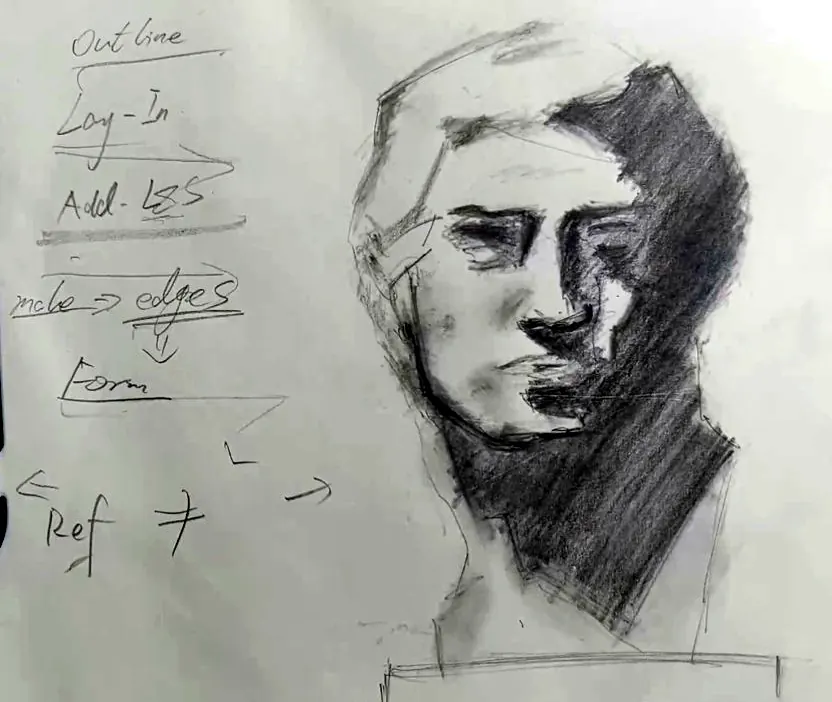
Stage 1: the outline and the lay-in
First I get the basic shape of the head correct. There is a little curve at the top of the head, so I mimic that curve, then go down. There is another little curve, which I can just hint at, and then a bigger curve going all the way down.
Before going further, look at where the light comes from. On this cast most of the light comes from the left, so the shadow falls to the right. That is the interesting thing when you first start to draw this head: if the light comes from this way, everything on the right side will, most of the time, be shadow. The eye, the nose: all of that on the right is shadow area. So you don’t need to worry much about the right side. Just remember which way the light comes from.
This changes how I draw the line. I don’t go all the way round the right side of the face following its contour. I go directly down, because I follow the shadow. From the head I go down where the shadow goes, then into the zigzag of the brow, which is the eyebrow, and down again. I am not outlining the features; I am following the edge of the shadow.
- Get the outside shape approximately correct. Add the neck, which you can sort of get here, and the plate the bust stands on. Don’t make it complicated; I get away with very little.
- Find the chin. The chin is essentially two lines. I put one line, and below it there will be shadow. Then a little hint of the shadow area down below.
- Brow, eyebrow, nose. The two eyes are a little different. On the right, everything is down in shadow. On the left it is not. So I go along the eyebrow, up and down, and for the eye socket on the right, everything is just shadow, so I only worry a tiny bit about it.
- The nose. There is a hint of the nose, and everything inside it is in shadow, so I only need the edges of the shadow, the edge between light and shadow. Mark the cutting points, the places where light turns into shadow, and run the line between them. I want a more prominent nose, so the line goes in and then out. There is a little bit of bone; if you want it more realistic, make that a little bigger. Then the end of the nose, and below it the typical triangular shape. Everything in that triangle is dark shadow.
- Simplify the hair. The hair goes all the way up in tiny points. You don’t need to follow every one; simplify it with a few cuts. If you want to do more, you can do more.
- The ear. You can’t see much of the ear, but there is an extrusion going out and a dent. Simplify it, and give it a tiny bit of shadow.
- Show it is a plaster cast. At the base there is an extrusion and a nice double line. Below it should be shadow, so I give it a shadow line. Then the plate, which is relatively small.
Remember, at this stage I am not blending and not adding light and shadow. I am only using the cutting points. As you can see, I just worry about the edges.
That gives a very rough relationship. At this point you can add a little more if it will make life easier later. Look at the eye: there is shadow and light, and a separation line between them, so you can say, “There is a separation line here.” Inside the big shadow you can get away with nothing, or you can add a little separation line as a hint. Later, when you lay everything dark, you will remember that there is a point there and can add it to your drawing.
Try it. Lay in the head the way I do here: decide where the light comes from, then draw only the outside shape and the edges of the shadow, following the shadow down rather than tracing round every feature.
Stage 2: add the light and shadow relationship
What I love about this is that once you have the edges of light and shadow correct, you can add the light and shadow very quickly. The previous step was the outline and then the lay-in, which is the step where you get just the edges of light and shadow. Now I add the light and shadow relationship.
I am not going to vary the pressure; I just put a general darkness in. Here is the rule: don’t use the darkest dark and don’t use the midtone. That is why this step is so important and so easy: you make it as uniform as possible. It is just colouring. Come on, it’s like a colouring book! You only need to keep every stroke as uniform as possible. How easy is that?
Contrary to what other teachers may tell you, I encourage you to do this fast. Don’t try to refine it at an early stage. Especially as a beginner, don’t try to make the so-called perfect drawing, the one you can show to your friends and say, “That’s a masterpiece I did.” Rest assured you are not going to get a masterpiece. And if you spend too much time refining something, using the same technique again and again, you won’t learn and you won’t improve, and that will make absolutely sure you never reach that stage of a masterpiece.
I don’t sharpen my pencil for this, so you may see some uneven tone. I want you to use this practice to get used to a carefree feeling in drawing. I don’t want you to feel restricted. This is the creation of art; nobody should tell you, “You have to do this.”
- Get the hard edges of the shadow approximately right.
- Where there is not much shadow, leave it. There is an ear, though, so below the ear should get some darkening, but not much detail. I just tone it a little.
- Omit a lot of the midtones. Just get the general block of the shadow area in, and don’t worry about every hard-cut line; you can get away with roughing the edges.
- If you see a part of the shadow that is a little darker, tone it a little more, and leave the rest.
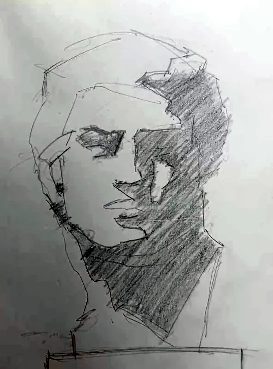
I did not use an eraser here. I could smudge with my finger, but right now I want it carefree. That’s it. Pretty simple, I know. You have added the basic light and shadow relationship without anything really dark, really light, or in between. Because the separation lines were already there, it is really, really easy. Do it quickly; I don’t want you spending too much time on this.
Try it. Fill the whole shadow shape of your lay-in with one even tone, as if you were colouring in a colouring book. No darkest darks, no midtones, and keep it quick.
Stage 3: add the midtones
Now the right side is one shadow block, but the light side, the left, looks too flat. There is detail there: some light, some shadow. But remember, this shadow is not as dark as the shadow side. We don’t yet have the really dark areas; we will fix those later. So I gently brush the tone in.
- Wherever there is a small cutting point on the light side, gently brush in a little tone. Don’t overdo the shadow. Just gently add it. That’s enough.
- The cheek. The cheek looks like shadow, but it’s not. It’s just a half-tone, because it is surrounded by light. It seems really dark, but it isn’t, so gently add a tiny bit. Follow that curve all the way down.
- The chin and mouth. There is some shadow there, but I prefer it as a midtone, not a really dark shadow. Add a tiny bit, up and down, to give the mouth some texture so it isn’t too flat.
- The top of the head. Add tiny bits there too.
You can also use this stage to rough the edges, because at the very beginning the edges are too strong. I prefer to do that later, though, because right now we are at the drawing stage, not the blending stage. If you think there is too much dark somewhere, rough it a little.
There are a lot of dark areas on this drawing, and you don’t want your drawing to get all muffled. Here I hold the smudging tool well back along its length, with my hand off to the side of the drawing. I might need to erase a little in places, but that doesn’t really matter at this point.
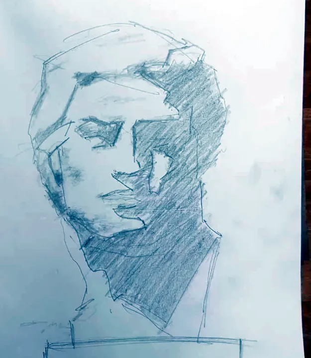
I’m pretty satisfied with it. If you think some of the midtone is too much, you can muffle it a little, but don’t overdo it. We now have a slightly more 3D feeling than before. But don’t overdo it, because if you do, the drawing gets dirty.
Try it. Go over the light side of your drawing and gently brush in the half-tones: the cheek, the mouth, the small cutting points. Stop as soon as it starts to look three-dimensional.
Stage 4: find the edges and the form shadows
Now the light area looks good. We have a little volume, and we could make it even smoother. Everything seems to be in order. But here is the thing. This is a very male figure, and a male character has a lot of edges. We call these form edges.
This is a very heroic character design. Just think about it: Michelangelo sculpted this. The hard brows and the hard turns are a general principle of character design. If you want a character to be aggressive, to be heroic, you add a lot of form edges. When we draw, we can use those form edges as well, to make this person more prominent and to make the edges clearer and more aggressive, whether for a bad character or a good one. Wherever a feature has hard turning edges, or just turning edges, you can use this technique.
This is why, at the lay-in and the first shadow, I told you not to do too much and to keep the midtone even lighter: we are now going to add darker areas. There is already a lot of dark, but it is not expressive enough. Don’t smudge it.
You don’t need to copy the photo. Add what you saw. So:
- Add the hard turning edges, wherever you see them. The eyebrow is the big one: go up, go down, a little curve, then all the way along. I can add a lot of hard turning edges there.
- The nose. For the wing of the nose, add a hint of its edges, and a little light on it as the highlight of the nose. Even if you can’t really see it in the reference, it doesn’t matter. You can hint at it, because you don’t want everything to smudge into the dark. Since we already have the edges, gently add a little more dark. You don’t even need to change pencils. Then the tip of the nose: lift the pencil away and you get a very prominent nose. Up and down a little, and you have a hint of the nostril.
- What you forgot. I just realised I didn’t draw one part. Add a tiny detail. Don’t be scared of it.
- The chin. The chin is a very prominent part of the figure, so I add more pressure at its cutting point without worrying too much.
- The heroic cut. Even where the reference doesn’t show much, I want to express that this is a really heroic male figure, so I give it more angle. Yes, you can do that. Even in the hair, if there is a cutting point, you can make it dark.
- The eyebrow, again. This is a really prominent eyebrow, a rock of an eyebrow, an iconic one. You can make the curve more prominent.
- The eye. I can’t really see the eye, so I don’t go far into it. Just a little hint that maybe there is an eye here.
At this stage I strongly discourage using an eraser. If you think a mark is too strong, feather it out. If you think you made a mistake, make it more prominent. Try to be a little more confident instead of constantly being scared that it’s not good, that you should do a bit more. Don’t be scared of making mistakes. Remember, we don’t even use an eraser here; we just smudge. The pencil I’m using is rough enough to smudge easily, so if you add some detail and think it’s too much, add a little pressure and smudge it down.
Here is a nice trick. If I overdo something, I smudge it so that the shape disappears and only the value is left. The cheek, for example, has a blending point. I add a small triangular shape and then smudge it to roughen its edges, because it is light surrounded by dark, and the reason for that transition is the form edges. Add a tiny bit here and there, roughen the edges, make it a little more charcoal-like. You can rough the edges with your fingers. But don’t overdo it: as I said, it gets dirty. (Ironically, I can now clean my hands a little.)
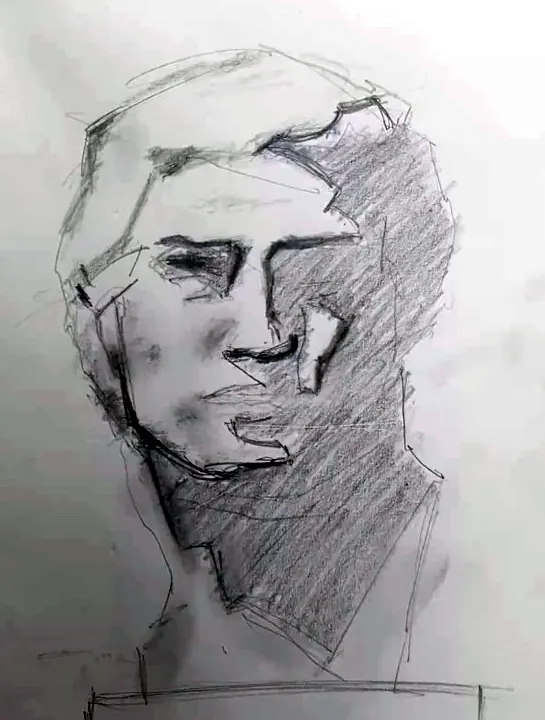
We are still avoiding the darkest dark in a lot of areas, because this dark only builds the light and shadow relationship. It is not the final dark.
Try it. Find every hard turning edge on your cast (brow, nose, cheekbone, chin) and strengthen it without an eraser. If a mark is too much, smudge it until only the value is left.
Stage 5: find and draw the darkest dark
Now we push the darkness further and find the darkest dark. If you don’t change pencils, you just need to add pressure. We have laid in, we have the basic light and shadow, and we have added the edges, so rest assured you won’t break your drawing. You can add pressure with ease. What I’m trying to do here is give you the courage to add pressure. If you think there is a shadow, there is a shadow. If you think it is the darkest dark, add the darkest dark.
I can’t stress this enough: this is just a reference. What you see is what you create in your own world, and it does not need to be exactly the same. As I have said countless times, don’t just copy the image. I don’t copy the edges 100%. I want it more heroic, so I add more chin. The relationships and the proportions are not 100% correct. That doesn’t really matter. Don’t just copy your reference, and draw with confidence. Adding the darkest dark is very good practice for your confidence. Sometimes the result won’t be exactly like your reference, and that’s okay. What you don’t want is to regret it after you’ve added the pressure.
The darkest dark is also a great opportunity to bring all the messy lines under control. You don’t want too many rough lines in the final drawing. You want it to look natural, as if it were one body.
- I try not to add texture here, but you can add a little texture in the darks.
- The eye. I can get the edges of the eye and see the double eyelid, so I add it as a hint. I want him more aggressive, so I make the eye squint a little and smaller.
- The right side of the nose. I add pressure there. You don’t need to copy it exactly; I just make something really dark.
- Hard edges. Maybe the reference goes up and down here. I just go down once. It doesn’t really matter.
- Overrule the separations. I connect this to the dark area. If I don’t want a separation, I paint over it; if I want one, I add a little separation so I know it’s a cutting point. This is your drawing, your perspective. To join an area to its edges, go over and connect them. Then push the edges by roughing them, most of the time roughing them up, not down.
- The mouth. A tiny bit of darkness and a little separation.
- The chin. If you want more chin, add more chin, a little further down.
Don’t use too much pressure for the rest. You have already put down several layers on your drawing, so you can easily add that extra layer of darkness without much pressure. You can rotate the pencil a little as you go, so you get a new layer.
There is a little reflected light here. I’ll leave this horizontal line out; if I don’t want something, I can just ignore it. I want the drawing loose, expressive and bold. Be brave, and don’t worry about some tiny detail you didn’t cover. If you don’t cover it, you don’t cover it. Meanwhile I’m roughing the edges to add a little volume, a little midtone. If you want a style that doesn’t show texture, go over the uneven parts so the texture shows less. Where there is too much separation between edges, rough them, rough them, rough them, but without too much pressure, or you will break the paper. You can buy high-quality paper; that depends on you. If you want something rounded, draw it rounded and rough the edges around it. Make it rough; make it loose.
The eraser comes last
Once you are satisfied with the darkest dark, you can erase. I tend not to erase much even now. But you can see we have rough edges that break the form. If you don’t want them to break the form, use the eraser to keep a clean-cut edge. I break off a new piece of eraser for this. What’s inside can stay a little rough, but if you want the edges clean, make them clean.
Your eraser is also a really great drawing tool. If you think something is a bit too much, just dab it and it turns down. You can use this to draw and to undo what you don’t want, so it is a drawing tool, not just a blending tool. You can even add texture with it, as I do around the mouth and the chin. Where I want to push the chin upwards, I dab it upwards. Don’t simply erase: plain erasing leaves a really clear cut line that I don’t want. Use these dabs instead.
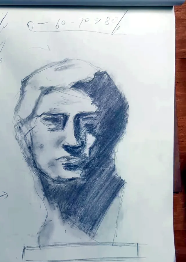
From zero to eighty per cent
Look at how quickly you can get one practice done without worrying too much about it. Going from zero to 60 or 70, maybe 80 per cent takes about 20 per cent of the time. To get to 90 or 95 per cent you may need to spend far more hours than are necessary. From a very practical point of view: that’s one practice done.
So we went through the whole process and tackled a fairly complex subject. We started with the outline and got the proportions approximately right. We laid in. We added the basic light and shadow relationship. We added the male characteristics: the edges, the form edges. We used our own understanding to tell our own story, and we did it with confidence, with speed and with awareness of time. Then we used the eraser to adjust: if the edges are a little too much, just dab them down. You can keep refining, but as I said, I prefer a time-limited method. Once you think it’s good, you stop, leave it there, and move on to the next stage. That’s basically what I learned.
You can practise this a lot. At an art school you will have tons of heads to play with. And you can keep using the same one: you have it in physical form, so rotate it, see it from a different angle, and practise again with a different light: outline, lay-in, light and shadow, edges, form edges. And don’t just copy the reference. Think about what you want to say.
Try it. Draw a full plaster cast head through all five stages in one sitting, and stop when it reaches about 80 per cent. Then turn the cast (or choose a different view) and do it again under different light.
Key takeaways
- Draw in stages: outline, lay-in, add light and shadow, form edges, then the darkest darks. Each stage keeps the next one safe.
- At the lay-in, follow the edge of the shadow rather than tracing round every feature, and use cutting points instead of shading.
- Fill the first shadow like a colouring book: one even tone, no darkest dark, no midtone, done quickly.
- Male, heroic characters are built from hard form edges; strengthen them without an eraser, and smudge whatever you overdo.
- The reference is only a reference. Don’t copy it; draw with confidence and tell your own story.
- Getting to 60–80 per cent takes about 20 per cent of the time. Stop there and move on to the next practice.
LIPAI WANG
A self-taught artist and teacher, known to his video students as William Jiamin. A former programmer, he teaches drawing, painting, pixel art and 3D the way he learned them: one solvable piece at a time.