Apples and Grapes — A Walkthrough with Claude Monet
How warm fruit, a cool striped cloth, and one sweeping diagonal carry an 1880 still life
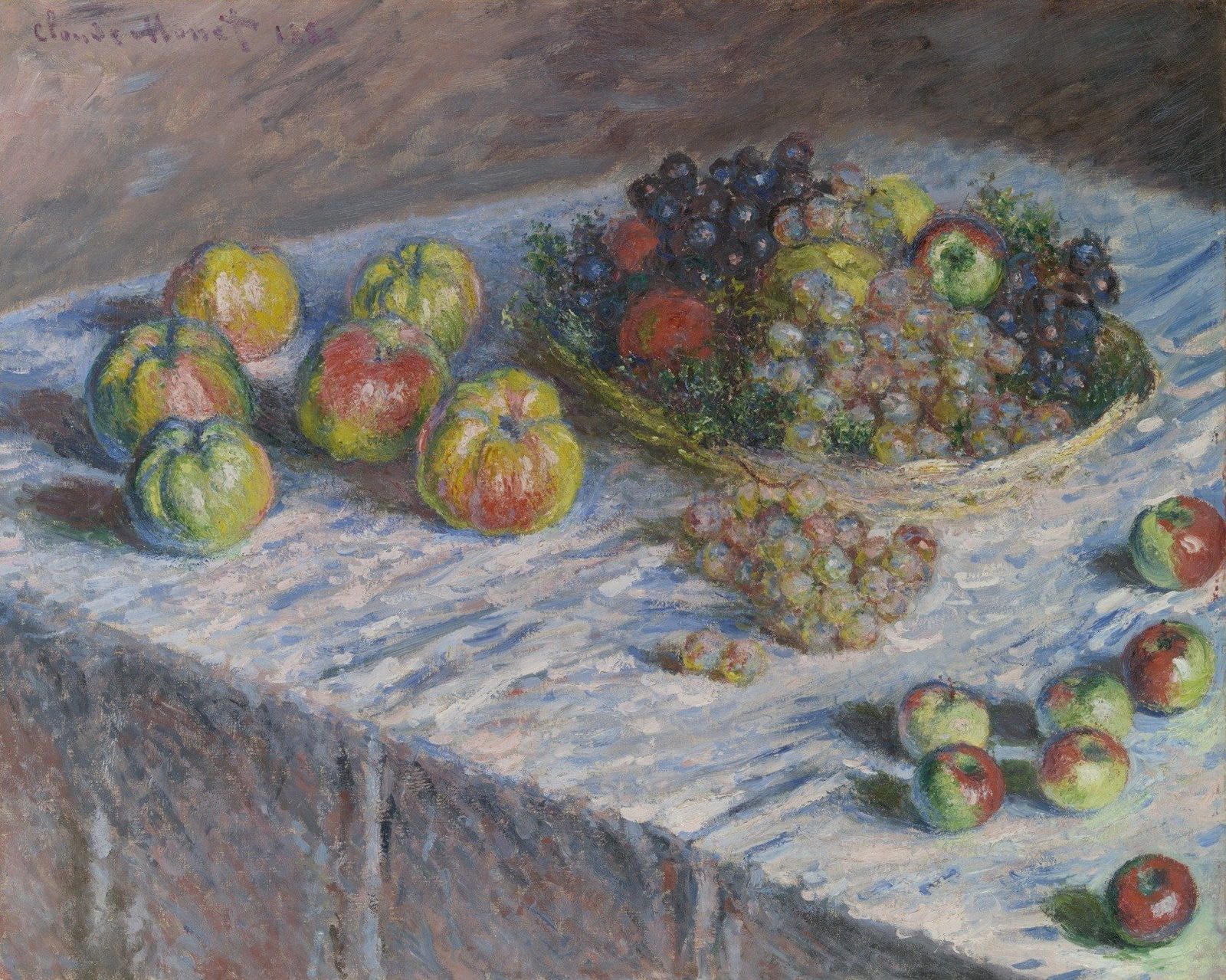
- Artist
- Claude Monet
- Title
- Apples and Grapes
- Date
- 1880
- Medium
- Oil on canvas
- Museum
- Art Institute of Chicago
- Image
- Public domain (CC0)
Open in Simple Art
Watch this story on iPhone and iPad, with offline downloads and a painting every day.
About 5 minutes of looking, in 11 parts.
Apples and Grapes · Monet, 1880
We are looking at Claude Monet's Apples and Grapes, painted in 1880, oil on canvas. The eye is immediately drawn into a quiet drama of fruit — a bowl of grapes set against a striped cloth, with apples scattered across the foreground. Notice how the dark backdrop pushes everything forward, almost theatrically.
A late Monet still life
This is late Monet, a period when he treated still lifes the way he treated gardens, with broken color and no drawn outlines. The handling is pure Impressionism: visible dabs and dashes, no blending, no hard edges. The artist's signature sits quietly in the upper left, almost as part of the texture itself.
Triangle and a single diagonal
The composition rests on an asymmetrical triangle: a small cluster of apples on the left, the grape bowl up to the right, and a cascade of fruit trailing toward the lower right. And here is the structural secret — one diagonal of cloth folds sweeps from the lower left up into the bowl. Follow that diagonal and you are tracing the entire eye path of the painting.
Soft daylight from the upper left
Light enters from the upper left, soft and diffused like a window on an overcast day. There are no hard cast shadows, only cool blue-violet accents tucked under each piece of fruit. That high-key cloth, the brightest apple highlights, and the deep grape darks give the whole canvas its luminous value structure.
The yellow apple — warm against cool
Start at the yellow apple on the left, the eye path's first stop. The brightest warm strokes cluster on its upper-left curve, while the lower-right edge dissolves directly into the striped cloth — yellow against blue, with no line between them. This is Monet's complementary punch: warm against cool makes the yellow actually vibrate.
The grape bowl — the focal point
Now drift into the focal point: the grape bowl, where the warmest reds and deepest purples meet the brightest highlights. Look how the dense violet-black grapes sit directly beside chalky green-white ones, with small red and russet notes tucked between them. Each grape is built from several distinct touches of color, not a single blended sphere — the bowl's rim is just a curving gesture of ochre dabs.
Apple highlights confirm the light
Pull back to the upper edge of an apple and notice the highlights. They are thick, pale dabs laid last, sitting over a warmer red local color. The brightest whites are not mixed into the base — they are pure touches that catch real relief on the canvas. This confirms the consistent upper-left light across the whole painting.
Scattered grapes in tiny dabs
Drift down to the scattered grapes at the lower right. Each one is just two to four small dabs: a cool shadow, a mid-tone, and a tiny warm highlight. Small gaps of cloth color show through between them, and the eye fuses the colors at distance. Scale the brushwork down and the fruit still reads.
A lost, shimmering edge
Look at the lower bulge of an apple where it meets the cloth. There is no drawn contour — just apple-green dabs alternating with cloth-color dabs along the boundary. Each mark keeps its own identity, but from a step back the edge shimmers into existence, and a cool blue cast shadow pools just beneath.
Cloth folds as gesture, not line
Now look at the cloth itself. Long curving brushstrokes of pale blue and creamy white are laid as single sweeping gestures, one per fold. Warm pinks and ochres punch through the cool palette. Direction of stroke does the structural work — there are no drawn folds, only paint gestures that follow the drapery from upper right to lower left.
The signature, scrawled and dry
Up in the upper left, the signature is a thin, scrawled line of dark violet-brown, dragged quickly with a nearly empty brush. It sits dry against the softer surrounding paint, almost scratched in. Monet signs the way he paints — economically, with broken marks that don't compete with the surface.
Look closer
7 details, each checked against a close-up of the picture.
-
The Grape Bowl Center
Deep purple grapes are juxtaposed directly against bright yellow-green grapes and red highlights.
The crop centers on the piled fruit, where dense clusters of deep violet-black grapes occupy the upper-left and meet a mass of lighter, chalky green-white grapes below. Strokes are clearly individual dabs and commas of color—each grape is built from several distinct touches rather than a blended form. Red and orange-russet notes are tucked between the dark and light clusters, with one small red fruit at left and a green-yellow apple near the top acting as warm-cool punctuation. The edge between the dark and pale grape masses is softened by intermingled half-tones (mauve, olive, dusty pink) rather than drawn as a line, and the bowl's rim is implied by a curving band of yellow-ochre dabs rather than a hard contour.
-
Cloth Folds
The cloth is composed of alternating long dashes of white and pale blue paint.
The crop shows a tightly cropped passage of folded cloth rendered with long, curving brushstrokes that follow the diagonal drape of the fabric from upper right to lower left. The marks alternate between thick, creamy whites and cooler pale blues, with the strokes broken and overlapping rather than blended. Small dabs of warm pink, ochre, and a single red accent punch through the cool palette, while the lower-left corner shifts into umber and slate where the cloth turns into shadow. The edges between strokes stay soft and open, so passages of fabric and background read simultaneously through the weave of paint.
-
Yellow Apple Contrast
The bright yellow apple is surrounded by cool blue and lavender strokes of the cloth.
The crop centers on a yellow apple form rendered with broken, scumbled strokes that range from pale lemon highlights to mossy green and ochre mid-tones. The fruit's upper-left contour catches the brightest warm light, while its lower-right edge dissolves into cool blues, lavenders, and violet-grays of the striped cloth. A coral-red apple mass intrudes from the bottom, separated from the yellow by a wedge of teal and pink-lavender fabric. Edges are not drawn but are built from juxtaposed warm and cool dabs, with no single boundary line marking the apple's silhouette.
-
Lost Edge of Apple
The lower edge of the apple blends into the cloth with soft, overlapping brushstrokes.
The crop shows the lower bulge of a green apple meeting a blue-and-white patterned cloth. The apple's underside curves from a yellow-green at center toward deep blue-green at the lower right, where soft, broken strokes interlock with the cloth's dabs of white, pink, and indigo. There is no hard contour line; instead, short curved strokes of apple-green sit beside small flecks of cloth-color, creating an interpenetrating edge. A cool blue cast shadow pools just below the fruit, and the cloth's hatching strokes read as both weave and pattern.
-
Artist Signature
The signature is rendered in thin, dark, scrawled brushstrokes against a brown background.
A cursive signature runs left-to-right across the upper third of the crop in a dark violet-brown pigment, applied as thin, broken, scratched-looking strokes that vary in pressure and length. The surrounding ground is built from short, overlapping brushstrokes in warm mauves, ochres and dusty pinks laid in loose diagonal and horizontal directions, with a single pale blue-grey dab sitting lower-center against an otherwise warm field. Edges of the signature letters are crisp and dry against the softer, more loaded surrounding paint, and the dark pigment is thin enough that slight underpainting shows through in places.
-
Apple Highlights
Bright white and pale yellow highlights are concentrated on the upper-left curves of the apples.
The crop centers on the upper portion of a red-pink apple, with a second yellow-green apple visible at the right edge. Bright white and pale cream dabs cluster on the upper-left contour of the red apple, sitting over pink and crimson strokes; small flecks of pure white also appear on the yellow-green apple's upper edge. Edges are not drawn but are implied by juxtaposed warm and cool strokes—pink against a dark blue-green ground on the left, ochre against deep teal on the right. The background is built from broken dashes of viridian, ultramarine, and ochre that read optically as a dark, shimmering field. Layering shows underlying warmer reds partially covered by cooler pink highlights and topped by the brightest whites, with green leaf-like strokes at the top.
-
Scattered Grapes
Individual grapes in the spill are rendered as small, distinct dabs of pink and pale yellow paint.
The crop shows a loose scatter of grape forms rendered as small, rounded dabs of pigment placed side by side rather than as continuous contours. Each grape reads as a tiny cluster of 2–4 touches combining a cool blue-grey or mauve shadow on one side with a warmer pink, ochre, or pale yellow highlight on the opposing side. The blue-and-white striped cloth behind and beneath them is built from longer, roughly horizontal strokes of cobalt, pale blue, and off-white that interleave with the grape dabs. Edges between individual grapes are implied by adjacent color contrast rather than drawn lines; where grapes touch, a thin sliver of cloth color or a darker accent separates them. The upper-left grape dabs carry the brightest tints, while lower-right dabs drift toward violet and burgundy, consistent with light arriving from the upper left.
Apples and Grapes in context
Why fruit, and why then
The Art Institute's catalogue gives several reasons why Monet returned to still life in 1879 and 1880 [2]. The twenty-nine works he had shown at the fourth Impressionist exhibition in 1879, mostly views of Vétheuil, drew largely negative reviews, and he may have wanted a subject that was less fraught and easier to sell [2]. He was also the breadwinner for his two sons and for the family of his patron Ernest Hoschedé, who had gone bankrupt and moved abroad [2]. The catalogue adds that the still lifes proved surprisingly lucrative [2].
The last of a group
The Chicago canvas belongs to a group of fruit pictures of comparable size made in 1879 and 1880 [2]. It shares the date 1880 with Pears and Grapes in the Kunsthalle, Hamburg, and with Basket of Apples, and the catalogue suggests that the date and the increasingly radical cropping probably make these three the last of the group [2]. Two pictures thought to be earlier, a horizontal Apples and Grapes and a vertical Still Life with a Honeydew Melon, show the basket on an angled table only partly covered by a cloth [2].
The catalogue calls the fruit pictures of these two years Monet's most concentrated effort in the genre, and the last time he paired apples with grapes [2]. A thread count matched this canvas to Cliff Walk at Pourville of 1882, which suggests the two pieces of linen were cut from the same bolt [2].
Sisley and Cézanne
The catalogue compares the painting with Apples and Grapes in a Basket by Monet's friend Alfred Sisley, now at the Clark Art Institute [2]. Because Sisley's canvas is signed but not dated, it's hard to say who followed whom, although its exaggeratedly tilted table may be a nod to Monet's pictures [2]. The essay also sets the work beside Paul Cézanne's The Plate of Apples, pointing to a similar tilted tabletop, an uncertain relation between table and wall, and outlines carved into thick paint with a pointed tool [2].
A basket of fruit on the boulevard des Italiens
Some touches were added over paint that had already dried, which may mean the canvas was begun in autumn 1879 and taken up again in April 1880 [2]. Monet was then preparing a one-man exhibition, held in June 1880 at the offices of the journal La Vie Moderne on the boulevard des Italiens, after yet another rejection by the Salon jury [2]. The painting is thought to be the 'Corbeille de fruits' listed as number 2 in that show, but the museum treats the identification as possible rather than certain [1][2]. The catalogue notes that the exhibition texts, including Théodore Duret's introduction, stressed Monet's work out of doors, and that he still chose to include this studio picture [2].
From Cahuzac to Ryerson
Monet's account book records a sale in November 1880 of three canvases, described as flowers and apples, fruit, and willows, to a buyer named Cahuzac for 1,000 francs together, and the museum thinks this painting was possibly among them [1]. Wildenstein's catalogue raisonné places it with Durand-Ruel in Paris around 1883, but the dealer's archives couldn't confirm this [1].
By May 1895 the picture belonged to Catholina Lambert of Paterson, New Jersey, who sold it to Durand-Ruel in New York on 16 May that year [1]. The Chicago collector Martin A. Ryerson bought it from the dealer on 18 December 1915 for $8,100, and it came to the Art Institute with his bequest in 1933 [1]. Ryerson owned sixteen paintings by Monet, and his collection went to the museum after his death in 1932 [3]. The catalogue considers the present gilded Durand-Ruel frame to be probably original to the painting [2].
- Claude Monet, Apples and Grapes (1933.1152): collection record with description, provenance and exhibition history (public API) . Art Institute of Chicago
- Gloria Groom, 'Cat. 17, Apples and Grapes, 1880', with technical report by Kimberley Muir, in Monet Paintings and Drawings at the Art Institute of Chicago (public API) . Art Institute of Chicago
- Martin A. Ryerson . Wikipedia