Looking at Bordighera
A walking tour of Claude Monet's 1884 Mediterranean landscape — eye path, broken color, and the foreground-as-window.
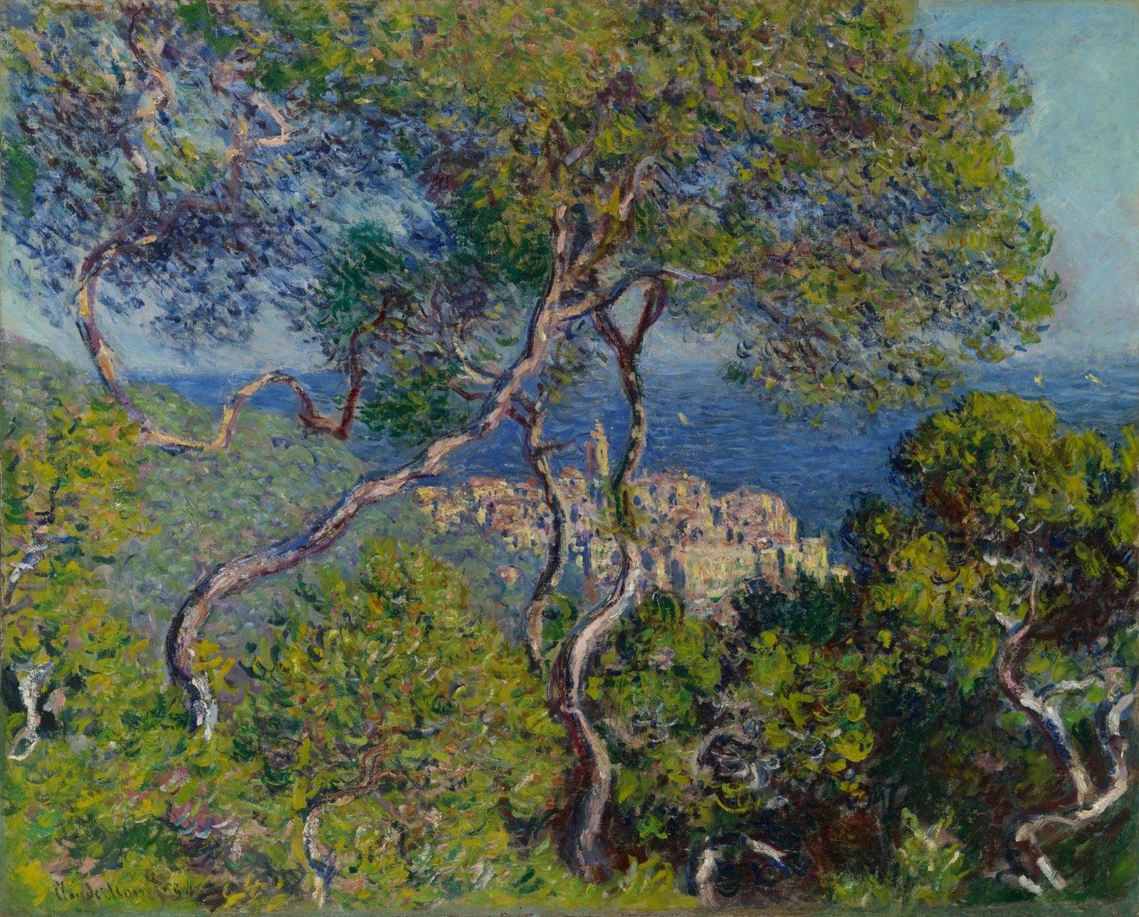
- Artist
- Claude Monet
- Title
- Bordighera
- Date
- 1884
- Medium
- Oil on canvas
- Museum
- Art Institute of Chicago
- Image
- Public domain (CC0)
Open in Simple Art
Watch this story on iPhone and iPad, with offline downloads and a painting every day.
About 5 minutes of looking, in 10 parts.
A wild Italian window
A tangle of branches cuts across a sea of green, and through the gap a pale village glints in the sun. This is Claude Monet's Bordighera, painted in 1884, and what looks at first like a wild hedge is really a carefully engineered window. Pull in close, because every stroke on this canvas is doing a job.
Mediterranean plein-air
Monet worked this oil on canvas outdoors on the Italian Riviera, and the broken color, the visible brushwork, the unblended dabs — every mark tells you he painted it under that bright southern sun, not in a studio. The foreground is dense wilderness, the middle distance is a strip of cobalt sea, and a tiny cluster of ochre buildings is the destination.
An S-curve as a curtain
Look at the structural skeleton of the canvas. A sinuous S-curve of branches sweeps from the upper-left corner down through the center, and the horizon of the sea sits as a sharp horizontal across the middle. Notice how those two lines — the curving branch and the flat sea — cross right where the village sits, locking the eye to the warm cluster.
Sun filtering down
The light comes from overhead, filtering through the canopy in dappled patches — bright Mediterranean daylight, not soft northern shade. Already we can see why this painting vibrates: every patch of yellow-green sits cheek-by-jowl with a deep blue-purple shadow, no transition between them, and that high contrast is the engine of the picture. Let's move into the canopy and look at why.
The outermost sweep
Begin at the upper-left curve — this single, sweeping arc of light-colored paint is the outermost branch and the entry point of the eye. It isn't drawn as one line; it's a sequence of short, loaded strokes, warm ochre and cream on the sunlit side, cool violet-browns on the underside, each dab placed edge-to-edge so the branch turns through color rather than through shading.
Ribbons of bark
Slide down into the trunk itself and look at the bark — it is laid in as long, twisting ribbons of impasto, whites and cool greys forming the lit ridge, warmer pinks and umbers articulating the shadow. The whole S-curve was probably painted as one continuous gesture, brush loaded and dragged while the paint was still buttery enough to hold its ridge.
Yellow-green against violet
Now the canopy itself, where the real color lesson lives. A bright yellow-green dab is placed directly beside a deep blue-purple stroke with no blending between them — complementary colors set hard against each other. The four swatches on screen show the palette at work: that hot yellow-green, that cool blue-violet, an olive mid-tone, and a warm ochre shadow. The dapple isn't painted; it's the viewer's eye doing the mixing.
Optical mixing in green
Move into the dense thicket and the principle repeats at full scale. The greens here are not one green — they are chartreuse, olive, emerald, and a deep blue-green that reads almost as shadow, every one placed as a separate dab with the underlying ground still showing between marks. Resist the temptation to soften the edges; the mosaic only works because each dab keeps its identity.
The luminous destination
Follow the S-curve down and we arrive at the village cluster — the focal point of the whole painting. Tiny rectangles of pale ochre, sand, and salmon pink, set against the deep cobalt of sea and sky. No architectural edges are drawn; the buildings exist purely as warm-on-cool temperature contrast, four hues in a tight cluster pushing forward against a single cool background.
Canopy vs undergrowth
Now compare two passages of green — the canopy we just left and the foreground undergrowth below. Up in the canopy the strokes are short, distinct dabs and the dabs lean diagonal and downward. Down in the undergrowth the marks change character: short, near-vertical flicks of olive and raw umber, tight, upright, almost bristling. Same broken-color method, two different stroke dialects for two different depths.
Look closer
7 details, each checked against a close-up of the picture.
-
Village Cluster
The buildings are rendered as small, rectangular blocks of pale ochre and salmon pink.
The crop centers on a clustered hillside village rendered as small, blocky dabs of pale ochre, sand, and salmon-pink, punctuated by a taller pale-yellow bell tower near the upper center. The buildings are loosely defined — no crisp architectural edges survive; instead, rectangles are suggested by clusters of warm light strokes set against darker cool passages that read as shadow or recessed wall. The village sits against a deep cobalt sea/sky that pushes the warm cluster forward, while dark, broken strokes of foliage and sinuous tree limbs in the foreground create a framing vignette. Edges where warm pinks meet cool blues are kept lively with adjacent broken strokes rather than blended transitions.
-
Bark Texture
The tree trunk is composed of long, twisting ribbons of impasto paint in white and grey.
The crop is dominated by two sinuous, S-curving tree branches that frame a glimpse of distant blue water and pale architecture. The bark is built from long, ribbon-like strokes of thick paint that follow the twisting contours of the wood, with whites and cool greys forming the lit side and warmer pinks, ochres, and dark umbers articulating the shadowed recesses. Brush edges are softened and broken, with the impasto ridges catching the light against the deeper green-blue foliage behind. Smaller hatched dabs of blue, lavender, and olive sit inside the negative space between the trunks, unifying foreground and background chromatically.
-
Foliage Dabs
The greens are built from distinct, unblended dabs of yellow, emerald, and deep blue.
The crop is dominated by a dense thicket of short, distinct dabs in a wide range of greens — chartreuse, olive, emerald, and a deep blue-green that reads almost as shadow. A sinuous, dark curving branch arcs from the upper edge down through the center, its bark built from purplish-brown, ochre, and cream dabs that remain visibly unblended. Small passages of violet, mauve, and a few pinkish flecks sit in the recesses between the brighter greens, suggesting cast shadow and atmospheric depth. The edges between strokes are crisp rather than feathered, so each dab keeps its identity even where greens meet.
-
Dappled Canopy Light
Bright yellow-green highlights sit directly adjacent to deep blue-purple shadows in the leaves.
The crop is densely packed with short, distinct brushstrokes that read as foliage rather than individual leaves. Bright yellow-green dabs sit immediately beside dark blue-purple strokes with no transitional blending, creating sharp chromatic contrast at every transition. Edges are soft and painterly but the colours themselves remain unmixed, producing the vibrating, dappled effect of light filtering through a canopy. Warm ochre and pinkish-grey passages appear in the lower third, suggesting shadowed under-foliage or distant glimpses through the leaves.
-
Upper Left Curve
A single, sweeping curve of light-colored paint defines the outermost branch.
The crop is dominated by a thick, curving branch that arcs from the upper right downward and to the left, rendered in warm ochre, cream, and pink-violet passages against a dense screen of cool blue, teal, and green foliage. The branch is built from a series of short, loaded strokes placed edge-to-edge rather than as one unbroken line; its sunlit edge is suggested by brighter, more saturated highlights while its shadowed underside recedes into violet-browns that echo the surrounding greens. Surrounding leaves are scattered as discrete dabs of broken color — ultramarine, viridian-touched greens, flecks of white, pink, and yellow — with no firm contour separating leaf from sky or leaf from branch. A second, smaller branch tip enters at the lower right, reinforcing the rhythm of curved arcs. The values contrast gently: the branch reads as the lightest passage in the upper left quadrant, anchoring the eye.
-
Foreground Undergrowth
The bottom foliage contains short, vertical strokes of olive and brown paint.
The crop is dominated by heavily worked impasto, with paint laid on in thick, ridged dabs that cast tiny micro-shadows along their edges. The lower band is a tangle of short, upright strokes in olive, ochre-brown, and dusty yellow-green, set against cooler passages of blue-grey and mauve shadow. Edges are unresolved, with each stroke abutting neighbors of contrasting hue rather than blending, producing a vibrating, broken-color field. The stroke orientation shifts from vertical flickers in the bottom third to more diagonal, sweeping gestures in the upper area where darker branches enter.
-
Artist Signature
The artist's signature is visible in the bottom left corner in a dark pigment.
The crop centers on a hand-written signature in dark, near-black pigment laid over a roughly brushed ground of yellow-green, olive, and earthy ochre. The script reads as cursive with rounded loops on the capitals and a descending tail, executed in a single confident pass. A thin vertical drip of dark paint runs downward just left of center, and the surrounding paint shows loaded, broken brushstrokes with raised ridges of impasto. The signature edges are soft but readable, suggesting the pigment was applied while the underlying paint was at least partially dry.
Bordighera in context
A tour with Renoir
Monet first saw Bordighera in December 1883, while touring the coast with Pierre-Auguste Renoir, and told his dealer Paul Durand-Ruel it was one of the most beautiful places they had visited [2]. He said he wanted to return alone to bring back a series of new things. So he arrived about a month later, working from a base at the Pension Anglaise [2]. He didn't return to France until mid-April 1884. Before leaving, he sent ahead forty-five paintings, which the art historian Paul Tucker reckons as roughly one every two days [2].
Moreno's garden and the tower path
From 7 February Monet had access to the private garden of Francesco Moreno on the Via Romana, a short walk from his lodgings, and painted it many times [2]. One of those garden views was promised to Berthe Morisot as a decoration for the dining room of her new house in Paris [2]. For this canvas and two related views he left the garden and went further up the road, to the area around the Torre dei Mostaccini, an ancient Roman watchtower [2].
The catalogue suggests Monet may have known Les motifs artistiques de Bordighera, a guidebook by Charles Garnier, architect of the Paris Opéra. The guide recommends stopping among the pines near the tower to look for subjects [2]. It presents this as a possibility, not as evidence that Monet followed the book [2].
Cézanne's L'Estaque, or the trees themselves?
The scholar Charles Stuckey connects the high viewpoint and the frame of trees to the visit Monet and Renoir had made a few months earlier to Paul Cézanne at L'Estaque, where Cézanne had painted the seaside village in a series-like way [2]. The catalogue also cites Monet's letters to Alice Hoschedé. They suggest that climbing above the palms, pines and olives was a practical answer to foliage that thrilled him but kept him from isolating a motif [2].
The one the dealer left
Durand-Ruel bought the other two views of the old town after Monet's return. But he didn't buy this one, perhaps, the catalogue suggests, because the trees almost hide the town [2]. In late April Monet had insisted on reworking his Italian paintings before handing anything over, so he could judge them as an ensemble [2].
Monet showed all three views at the Sixth International Exhibition of Painting and Sculpture at the Galerie Georges Petit in May and June 1887 [2]. The critic Gustave Geffroy, later Monet's biographer, called it an extraordinary canvas, ablaze with light. Still, it remained unsold until 1891 [2].
A Chicago 'Antibes'
According to Wildenstein, Monet sold the painting in September 1891 to Isidore Montaignac, acting as agent for Knoedler and Company of New York, who sold it that month to Potter Palmer of Chicago [1]. Wikipedia says the Palmers had become clients of Durand-Ruel and came to own twenty-nine Monets, and that their pictures form the core of the museum's Impressionist collection [3]. When the Art Institute exhibited Mrs Potter Palmer's collection in 1910, this painting was listed under the title Antibes [1]. The family gave it to the museum in 1922 [1].
- Claude Monet, Bordighera (1922.426): collection record with description, provenance and exhibition history (public API) . Art Institute of Chicago
- Gloria Groom, 'Cat. 20, Bordighera, 1884', with technical report, in Monet Paintings and Drawings at the Art Institute of Chicago (public API) . Art Institute of Chicago
- Bertha Palmer . Wikipedia