Painting the Air: Monet's Branch of the Seine near Giverny (Mist)
A close look at how Monet built a landscape from atmosphere alone
- Artist
- Claude Monet
- Title
- Branch of the Seine near Giverny (Mist)
- Date
- 1897
- Medium
- Oil on canvas
- Museum
- Art Institute of Chicago
- Image
- Public domain (CC0)
Open in Simple Art
Watch this story on iPhone and iPad, with offline downloads and a painting every day.
About 5 minutes of looking, in 10 parts.
A Painting of Almost Nothing
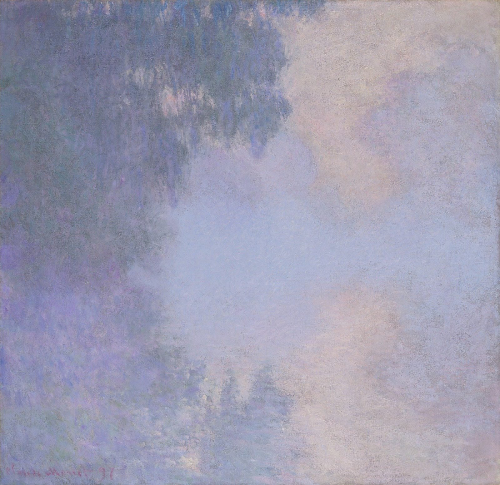
This is a painting of almost nothing — and that is precisely the point. You are looking at Claude Monet's 'Branch of the Seine near Giverny (Mist)' from 1897, and the canvas refuses to give you a clear river, a clear bank, or a clear sky. Watch as the camera settles in.
Monet at Giverny, 1897
Painted in oil on canvas, this is a late Impressionist work from Monet's years at Giverny, where he returned again and again to the Seine to study how morning mist dissolves every hard edge. The whole field is high-key — luminous rather than shadowed — and your eye is meant to drift, not to land.
A Diagonal Without a Focal Point
Notice how the composition refuses a single anchor. Instead, Monet sets up a soft diagonal pull — a dark, cool mass in the upper left and a pale, warm expanse sliding toward the lower right. The thirds grid reveals that this is not a coincidence; the entire structure rides on those intersections.
Luminous Mist, No Sun
Begin in the brightest passage, the high-key luminosity in the upper right. This is not lit by a directional sun — the light is diffuse, scattered by the mist itself. The cream and off-white are scumbled, dragged dry across a cooler lavender underlayer so the cool tone keeps flickering through the gaps. That is what gives the haze its glow rather than a dead, flat white.
Trees Built from Vertical Dabs
Now back to the dark mass at the upper left, where the trees are made entirely of short, vertical, dabbing strokes in blue and violet. No leaf is drawn; no trunk is rendered. The mass is built by tapping a loaded brush upright, alternating cool blues with warmer lilacs, and letting the gaps between dabs do the atmospheric work. Resist the urge to blend — Monet is painting with air, not outline.
Where Violet Meets Cream
Sliding diagonally across the canvas, we arrive at the painting's true subject: the transition zone where dense violet-blue on the left thins into pale cream and dusty rose on the right. This is not a fog you premix and brush in one stroke. The cooler, more saturated notes sit on one side, the lighter, warmer notes on the other, and they interlock through small broken dabs across the boundary. Your eye, not your palette, mixes the gradient.
Edges That Dissolve
Look at how that dark foliage mass ends — not in a drawn edge, but in a scatter. The cool vertical strokes do not stop at a line; they thin out, a handful of dark flecks drift into the pale lavender and cream, and the boundary is read through changing density. Atmospheric perspective here is built by losing density, not by softening a wet edge.
Lavender Ground, Narrow Values
Down in the lower left, the foreground is a high-key field of cool lavender and muted grey-blue, with only a few warm pink flecks scattered across it. Notice that there are no white highlights and no deep darks here — Monet holds the value in a narrow band and lets the small warm accents optically intensify the cool field. Hue, not contrast, is doing the work of light.
A Quiet Warm Glow
And here, in the lower right, that warm accent reappears — pale rose and peach scumbled over a cool violet underlayer. The warmth is just slightly more saturated than its neighbor, but because the values match, it reads as a quiet glow rather than a hot spot. A small proportion of a warm complement is all it takes to keep the entire cool palette alive.
One Decisive Line
Finally, drop to the lower left corner. Against all this broken, atmospheric haze, Monet commits to one decisive, linear stroke of darker pigment: the signature 'Claude Monet 97.' That single calligraphic line is the crispest contour on the entire canvas, and it only reads because everything around it has stayed soft and unresolved.
Look closer
7 details, each checked against a close-up of the picture.
-
Atmospheric Contrast Zone
A transition occurs from deep violet-blue tones on the left to pale cream and rose tones on the right.
The crop captures a diagonal transition between two atmospheric registers. On the left, dense accumulations of short, broken dabs in deep violet-blue and indigo are interspersed with small flecks of warm pink and pale lavender, suggesting the suggestion of foliage or tree masses rather than any defined leaf. Moving across the center, these marks thin out and become cooler, lower-contrast strokes in soft lavender and grey-blue. The right half is dominated by broad, wetter-looking passages of pale cream and dusty rose with only sparse, tiny dabs of blue-violet interrupting the surface. There are no hard edges anywhere; every boundary between color notes is softened by adjacent strokes and by what looks like scumbled or thinly dragged paint.
-
Monet Signature
The text 'Claude Monet 97' is written in a darker, linear pigment in the lower left.
The crop shows a hazy atmospheric band dominated by pale lavender, cool blue, and soft pink, with vertical suggestions of reflected reeds or grasses along the lower edge in magenta-pink. Brushstrokes are short, broken, and loosely dabbed; edges between adjacent colors are soft and unresolved, with wet-into-wet blending rather than crisp contour. In the lower left, darker linear pigment — a brown-violet reading against the pale surround — forms legible letterforms reading 'Claude Monet 97', confirming the signature. No clear directional light or hard horizon is visible; the entire field reads as uniform, scumbled atmosphere with value held in a narrow high key.
-
Broken Foliage Strokes
The dark mass consists of short, vertical, dabbing brushstrokes of blue and violet.
The crop reveals a dense field of short, upright brush dabs laid side by side rather than blended. Darker blue and violet strokes cluster on the left and upper portions, while paler lilac and warm grey-violet dabs open up toward the upper right, where the paint thins and lighter tones show through. Edges are not crisp; each dab has a soft, broken perimeter because neighboring strokes of contrasting value sit next to it without being smoothed. The marks are built in multiple thin layers, with cooler pigment appearing to sit under warmer pinker touches in the highlights, producing optical mixing at reading distance.
-
Dissolving Form
The edge of the dark foliage mass blends softly into the center mist without a hard line.
The crop shows a dark, cool-toned foliage mass occupying the upper-left, made of vertical, broken brushstrokes in muted blue-greens and greys. Along the diagonal middle zone, these cooler marks scatter and thin out, mixing with warmer lavender and cream tints of the mist without forming a continuous contour. The lower-right is a smooth, pale field of soft lavender-pink and cream, with only a few isolated darker flecks drifting into it. There is no hard boundary; instead, the edge is read through the changing density of broken strokes. Impasto is visible in the upper darks and flattens toward the misty lower field.
-
High-Key Luminosity
The brightest area of the painting contains pale yellow and white scumbled paint.
The crop shows a high-value, low-chroma passage dominated by scumbled, broken marks of pale cream, off-white, soft lavender, and faint pink-peach over a cooler grey-blue undertone. Individual strokes are dry, thin, and irregular — many drag only partially across the surface, leaving small gaps where the primed weave shows through. Edges between colour zones are dissolved; there are no crisp contours, only gradual shifts as one broken hue sits beside another. The warmest (yellowest) cluster sits in the upper-right quadrant, while cooler lilac passages cluster lower-right, producing a soft temperature gradient rather than a defined form. A faint horizontal scoring — possibly a seam or scrape mark — runs across the upper third.
-
Lavender Ground
The lower-left foreground uses a blend of lavender and muted grey-blue.
The crop is an all-over field of small, broken dabs and short strokes with no resolvable edges or drawn contours. Cool lavender (~#A8A6D8) sits against pale grey-blue (~#BFC8D4), and small warm flecks of dusty pink and peach (~#D4B4B8) are scattered across the surface as accent notes against the cooler dominant. Edges between hues are wet-into-wet soft; there is no hard line, only chromatic transitions where one dab meets the next. Values stay in a narrow high-key band — no deep darks and no white highlights — which flattens recession and reinforces the misty, atmospheric reading.
-
Warm Accent
Pale rose and peach hues are layered into the lower right quadrant.
The crop is dominated by diffuse, low-contrast fields of pale lavender and dusty blue interrupted by warm peach and rose passages that cluster more densely in the lower right. Edges between hues are not crisp — they feather and interlock through short, broken strokes and irregular scraped-looking ridges that read as textured grain rather than distinct shapes. Values are narrow and luminous, with the warmest peach notes sitting just slightly more saturated than the surrounding violet-grays, creating a soft warm-cool adjacency rather than any hard contour. Layering appears to occur in roughly horizontal bands that gently tilt, with lighter cream and ivory scrapes crossing both warm and cool passages and unifying the surface.
Branch of the Seine near Giverny (Mist) in context
Begun a summer earlier?
The painting is signed and dated 1897, but the Art Institute's catalogue suggests that Monet may have started it in 1896 [2]. Its first layers use deeper blues and greens, a palette close to Morning on the Seine, near Giverny of 1896 in the Museum of Fine Arts, Boston, and these were later covered with paler paint [2]. In November 1896 Monet wrote to Durand-Ruel that, because of terrible weather, he planned to stop until the following year [2]. The catalogue offers this as a possibility drawn from technical and documentary clues, not as a settled fact [2].
Winters on the coast, summers on the river
The writer Maurice Guillemot reported that Monet spent his winters on another series, the cliffs at Pourville near Dieppe [2]. The catalogue entry for The Customs House at Varengeville dates those Normandy campaigns to February to April 1896 and January to April 1897, counting nearly fifty canvases from them [3]. And the art historian Paul Tucker contrasted the two groups, finding the coast pictures expansive and volatile while the river pictures felt contained and hushed [2].
The catalogue nevertheless points to shared habits, including soft, muted palettes, surfaces that look matt, and an interest in the enveloppe, the changing atmosphere around a motif [2][3]. In both the Varengeville picture and this one, Monet laid in stronger colour first and covered it with paler paint once it had dried [2].
Eighteen mornings at the Galerie Georges Petit
Guillemot's account appeared in La Revue illustrée less than three months before Monet's one-man exhibition at the Galerie Georges Petit in June 1898 [2]. Eighteen works from the series were shown there, probably including this one, alongside pictures from the Rouen Cathedral, Norway and Chrysanthemum series, plus twenty-four views of the Normandy coast [2]. The museum places that exhibition at the head of the painting's exhibition history [1].
Corot on his mind
Critics had already compared Monet's Rouen Cathedral paintings with the work of Jean-Baptiste-Camille Corot, and the catalogue notes that Mornings on the Seine revived the comparison [2]. Corot's Recollection of Mortefontaine had been on view at the Louvre since 1889, and Corot too had worked early in the morning to catch fleeting effects of light [2]. Guillemot quoted Monet remarking on how Corot assembled composite pictures from quickly brushed studies, leaving traces of his first stages visible on the canvas [2].
Canvas and buyers
The canvas is not a standard size and was probably custom ordered. Yet its threads match seven other Monets at the Art Institute, among them several Stacks of Wheat and Water Lily Pond, which suggests the fabric came from a single bolt [2].
The earliest owner the museum can document is Jos Hessel of Paris, who had the picture by October 1916 [1]. Wildenstein states that Monet sold it to Durand-Ruel in 1913, but the dealer's archives do not mention that sale [1]. Durand-Ruel in Paris bought it from Hessel on 26 October 1916 for 20,000 francs, and the New York branch then sold it to Martin A. Ryerson on 8 December 1916 for $10,000 [1]. It was shown in New York that December as Matinée sur la Seine and came to the Art Institute with Ryerson's bequest in 1933 [1].
- Claude Monet, Branch of the Seine near Giverny (Mist) (1933.1156): collection record with description, provenance and exhibition history (public API) . Art Institute of Chicago
- Jill Shaw, 'Cat. 36, Branch of the Seine near Giverny (Mist), from the series Mornings on the Seine, 1897', with technical report, in Monet Paintings and Drawings at the Art Institute of Chicago (public API) . Art Institute of Chicago
- Jill Shaw, 'Cat. 35, The Customs House at Varengeville, 1897', in Monet Paintings and Drawings at the Art Institute of Chicago (public API) . Art Institute of Chicago