Renoir's Chrysanthemums — A Walk Through Optical Color
How Renoir builds a bouquet from unmixed dabs, dissolved edges, and a hot-cool temperature game, 1881–82.
- Artist
- Pierre-Auguste Renoir
- Title
- Chrysanthemums
- Date
- 1881–82
- Medium
- Oil on canvas
- Museum
- Art Institute of Chicago
- Image
- Public domain (CC0)
Open in Simple Art
Watch this story on iPhone and iPad, with offline downloads and a painting every day.
About 4 minutes of looking, in 11 parts.
A burst of blooms
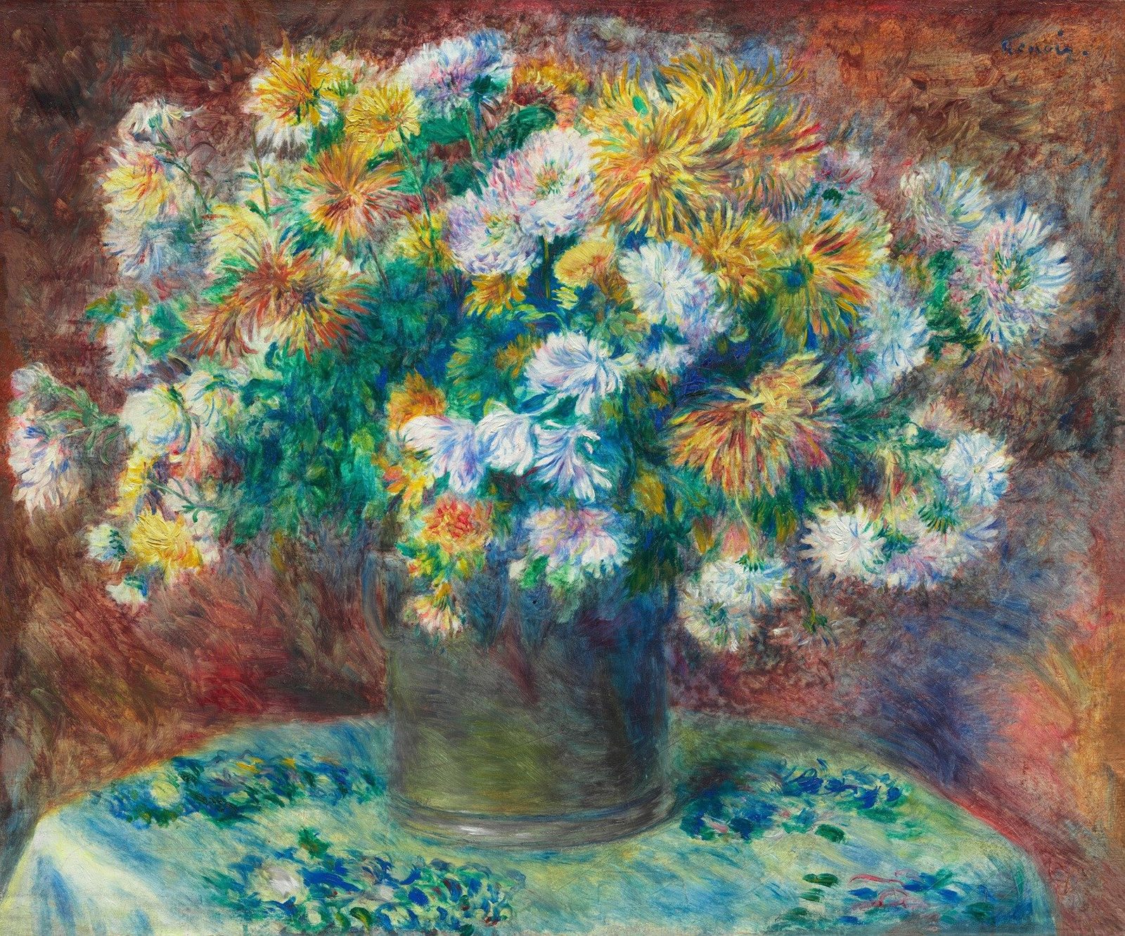
Step back. Before you is a single canvas exploding with chrysanthemums, and our eye is already being pulled into the white and yellow heart of the bouquet. The frame feels small but the energy is enormous — a small dark vase somehow containing a whole garden.
The artist and date
This is Pierre-Auguste Renoir's Chrysanthemums, painted in 1881 to 1882 in oil on canvas, a French Impressionist still life. It is not dated in the corner — only signed, as we'll see — but the broken brushwork and dissolved edges place it firmly in his mature period.
A pyramid on a vase
Look at the structure. Renoir builds a stable triangle: a wide, pyramidal mass of blooms rising to a high apex, all anchored by the small, dark, centered vase below. The focal cluster sits just above the upper third line, almost exactly where the thirds intersect — that is where your eye lands first.
Soft, ambient light
The light is soft and ambient, as if filtered through a studio window. There are no harsh cast shadows; instead, the brightest values cluster in the white petal centers, while the deepest darks hide inside the vase and the recessed pockets of leaves.
Hot surround, cool table
Now notice the temperature game. A hot red-orange surround frames the bouquet on the left and at the edges, and a cool blue-green tablecloth sits below — the chrysanthemums ride the warm-cool boundary right between them. That contrast is what makes the whites feel almost lit from within.
The glowing whites
We drift into the heart of the bouquet, where the central white blooms live. Up close, there is no pure white anywhere — only thick, unblended dabs of warm cream, pale yellow, and cool light blue, placed side by side. It is the eye that does the mixing, and that is why the petals seem to glow rather than sit on the canvas.
Radial petal strokes
Move with me to the right, where the yellow heads explode outward. Each petal is a single loaded stroke pulled from a compact central core, fanning radially like spokes. Watch how a cadmium orange sits next to a stroke of cool blue, and a yellow next to violet — those complements vibrate against each other, no outline needed.
Coral and deep red
Now swing left to the salmon and pink heads. They look like one color from a distance, but close up they are built from alternating touches of coral, creamy white, and deep red-magenta, dabbed in a loose starburst. The deeper reds cluster near the densest part of the bloom to anchor the value.
An edge that isn't drawn
Drop your gaze to where the dark vase meets the red background. There is no drawn line here at all — just short, broken strokes of dark olive and blackish-green interleaving with brick-red and salmon. The boundary exists only in the eye, held together by the optical shock of warm pressed against cool.
Complementary flecks
Follow the eye path down to the tablecloth. This is the cool counterweight: distinct flecks of turquoise and deep blue sit directly against creamy yellow strokes, comma-shaped and unblended. The turquoise and yellow vibrate, and the eye reads a brighter, livelier surface than any pre-mixed green could give you.
Sweeps, not dabs
Step back into the green leaves, and notice a change of vocabulary. Where the petals are short dabs, the foliage is made of longer, flatter, sweeping strokes — ribbons of sap green, viridian, and teal laid in roughly parallel gestures. The contrast in stroke length alone separates leaves from petals without a single drawn contour.
Look closer
7 details, each checked against a close-up of the picture.
-
Central White Blooms
The white petals are composed of thick, overlapping dabs of white, pale yellow, and light blue.
The crop centers on two large white chrysanthemum blooms surrounded by a dense field of green, teal, and ochre foliage. The petals are built from short, thick dabs of impasto where warm white, pale buttery yellow, and cool light blue sit directly adjacent without blending, so the eye optically mixes the hue. Edges between petal and background are soft and broken—pale dabs sometimes sit on the dark green field and vice versa, so the contour is implied rather than drawn. The surrounding greens and teals are laid in similarly broken, comma-like strokes that vary in value from deep blue-green in the recesses to bright viridian in the lit passages.
-
Yellow Petal Texture
The yellow chrysanthemums use radial, directional strokes that emanate from a central core.
The crop isolates two chrysanthemum heads whose petals are built from elongated, tapered strokes that fan outward from compact central cores in the upper and lower portions of the frame. Edges are not drawn but implied by adjacent color shifts—warm yellows, cadmium oranges, and crimson strokes meet cooler blues, violets, and muted greens without a hard contour between them. Each 'petal' is a single loaded stroke laid flat to the surface rather than modeled with gradation, and the deepest accents sit as small comma-shaped marks at petal tips rather than along an outline. The optical mixing happens where complementary pairs (orange next to blue, yellow next to violet) appear within a few millimeters, making the warm notes vibrate against the cool halos.
-
Tablecloth Complementary Colors
The tablecloth contains distinct flecks of turquoise and deep blue placed beside creamy yellow strokes.
The crop reveals a field of loose, broken brushstrokes where turquoise and deep blue flecks sit directly against creamy yellow marks. Strokes are short, comma-shaped, and unblended, allowing the eye to mix the turquoise-blue against its warm complement. Edges are soft and visible as separate strokes rather than melted gradients, with no hard contours defining object boundaries. The turquoise and yellow passages read as the dominant optical activity, while deeper blue dots anchor the cool side.
-
Vase-Background Transition
The edge of the dark vase dissolves into the red background without a hard outline.
The crop captures the left-hand edge of a dark vase pressing against a warm, rust-red background. There is no drawn contour; instead, the boundary is formed by short, broken strokes of dark olive and blackish-green meeting strokes of muted brick-red, maroon, and ochre. Cooler grey-greens and a few blue flecks are scattered through the dark mass, while the red field contains lighter salmon and pinkish passages that almost reach the vase edge before being absorbed. The lower portion shows denser, more horizontal scumbling where the vase appears to meet a darker green-brown table surface, and the texture is uniformly rough and scumbled with visible ridges from the brush.
-
Artist Signature
The name 'Renoir' is written in cursive in the upper right corner.
A cursive signature reading 'Renoir' stretches across a warm, reddish-orange painted ground. The lettering is laid down in a dark, slightly violet-tinged blue that sits in raised, impasto ridges against the more broken, scumbled background. Each letter is formed with a single, continuous, pressure-varying stroke — thick on the downstrokes, tapering on the upstrokes — with the final flourish trailing off into a dot at right. The background shows short, choppy dabs of cadmium-orange, brick-red, and a few desaturated cream passages, all blended optically rather than mixed on the palette.
-
Pink/Salmon Blooms
The pink flowers on the left are built from alternating strokes of coral, white, and deep red.
The crop centers on a salmon-pink chrysanthemum head occupying the upper half, with petals radiating outward in a loose starburst. The bloom is constructed from visible strokes of coral pink, creamy white highlights, and deeper red-magenta accents, with no hard contour outlining the flower. Below, foliage is rendered in broken green and teal strokes that bleed into the lower-left cream area, suggesting both leaves and possibly a pale fabric or additional petals.
-
Foliage Strokes
The green leaves are rendered with longer, flatter, sweeping strokes compared to the dabs of the petals.
The crop juxtaposes two distinct brushwork registers: the left two-thirds is built from elongated, roughly horizontal sweeps of varied greens (sap, viridian, teal, ochre-green) laid in flat, ribbon-like gestures, while the right third resolves into short, clustered dabs of cream, pale yellow, orange and pink that read as petal mass. Foliage strokes run more or less parallel and overlap in thin scumbled layers, leaving tiny gaps of warmer underpainting showing through. Edges throughout are soft and broken; there are no firm contours, and the boundary between leaves and petals is set only by a shift in stroke length and direction. Darker greens pool in the upper-center to push the foliage back, while the lightest dabs sit at the right edge and catch the diffuse light.
Chrysanthemums in context
A bouquet kept at home
The Art Institute's catalogue gives the canvas no specific setting. Instead, it suggests the flowers may be one of the bouquets Renoir liked to keep at home, ready to paint when the mood took him [2]. A light from the left throws a blue shadow on the wall to the right, and that shadow follows the curve of the table [2]. From this, the catalogue infers a small side table in a rounded nook, much like those found in the entrance halls of middle-class houses [2].
Still life in Renoir's output
The catalogue calls Renoir's still lifes an under-studied part of his career, though the number of documented canvases suggests they mattered to his development [2]. His first retrospective, held on the boulevard de la Madeleine in April 1883, included six still lifes among seventy works, and the proportion was roughly the same at the 1892 retrospective organised by Paul Durand-Ruel [2].
The catalogue slots Chrysanthemums between the looser Impressionism of Peonies, of about 1880, and his later flower pieces [2]. It sees the plain earthenware crock, the oval bouquet centred on the canvas and the table's curve as a firmer geometry, and ties this to a classicism that emerged in Renoir's work after his visit to Italy in the autumn of 1881 [2]. Julie Manet later recorded him saying that one should paint still lifes to learn to paint quickly [2].
A Japanese flower in a French room
Chrysanthemums were first imported to France from the Far East during the Revolution, and in the early twentieth century they were still thought of as an exotic Japanese feature of French gardens [2]. The catalogue notes that Renoir may have seen Claude Monet's paintings of the flower from 1878 and 1881, and that a mass of chrysanthemums also fills the background of his portrait of Jeanne Samary, A Girl with a Fan, of about 1881 [2].
Two varieties show up here: an orange starburst with long straight petals and a white, rounder bloom with short, dense petals [2]. The catalogue compares this mix of varieties, along with the flat leaves set against highly detailed flowers, to Hokusai's woodblock print Chrysanthemums and Bee [2].
Made in a hurry
Conservators note a certain casualness in how the canvas was prepared [2]. The white ground covers only the picture area and was spread unevenly with a palette knife, which dragged dry lumps across the surface and left curving gouges [2]. Renoir painted right over them [2]. The ground's make-up and the stamps on the back, from a Paris colour merchant in the rue de la Rochefoucauld, point to a commercial preparation, though it isn't clear who actually applied it [2].
Under the paint sits some drawing: fine graphite lines for some of the yellow flowers and thin brown paint for the petals of at least one white bloom, left exposed in places [2]. Renoir tackled parts of the background first, leaving an oval space for the bouquet, and in places he wiped the paint back so a thin film settles into the gouges and reads as shadow [2]. Analysis picked up pigments including cobalt blue, viridian, vermilion, carmine lake, zinc yellow and cadmium yellow [2].
From Durand-Ruel to Ryerson
Renoir sold the painting to Durand-Ruel in Paris on 14 December 1882 for 600 francs [1]. It moved to the firm's New York branch in 1897 and may have been the Chrysanthèmes shown at the Salon d'automne in 1904, though the museum lists that showing only as possible [1]. Martin A. Ryerson of Chicago bought the canvas on 17 February 1915 for $7,500 and bequeathed it to the Art Institute, where it arrived in 1933 [1]. The frame appears to be the original one, a gilt Régence Revival piece made in Paris in the late nineteenth century and associated with Durand-Ruel [2].
- Pierre-Auguste Renoir, Chrysanthemums, 1881-82 (1933.1173): object record, provenance and exhibition history . Art Institute of Chicago (public API)
- John Collins, Kelly Keegan and Kirk Vuillemot, 'Cat. 15, Chrysanthemums, 1881/82', in Renoir Paintings and Drawings at the Art Institute of Chicago . Art Institute of Chicago