Cliff Walk at Pourville — A Study in a Single Warm Note
Monet's 1882 oil on canvas, narrated along the eye from parasol to sailboats
- Artist
- Claude Monet
- Title
- Cliff Walk at Pourville
- Date
- 1882
- Medium
- Oil on canvas
- Museum
- Art Institute of Chicago
- Image
- Public domain (CC0)
Open in Simple Art
Watch this story on iPhone and iPad, with offline downloads and a painting every day.
About 7 minutes of looking, in 11 parts.
One orange parasol on a vast coast
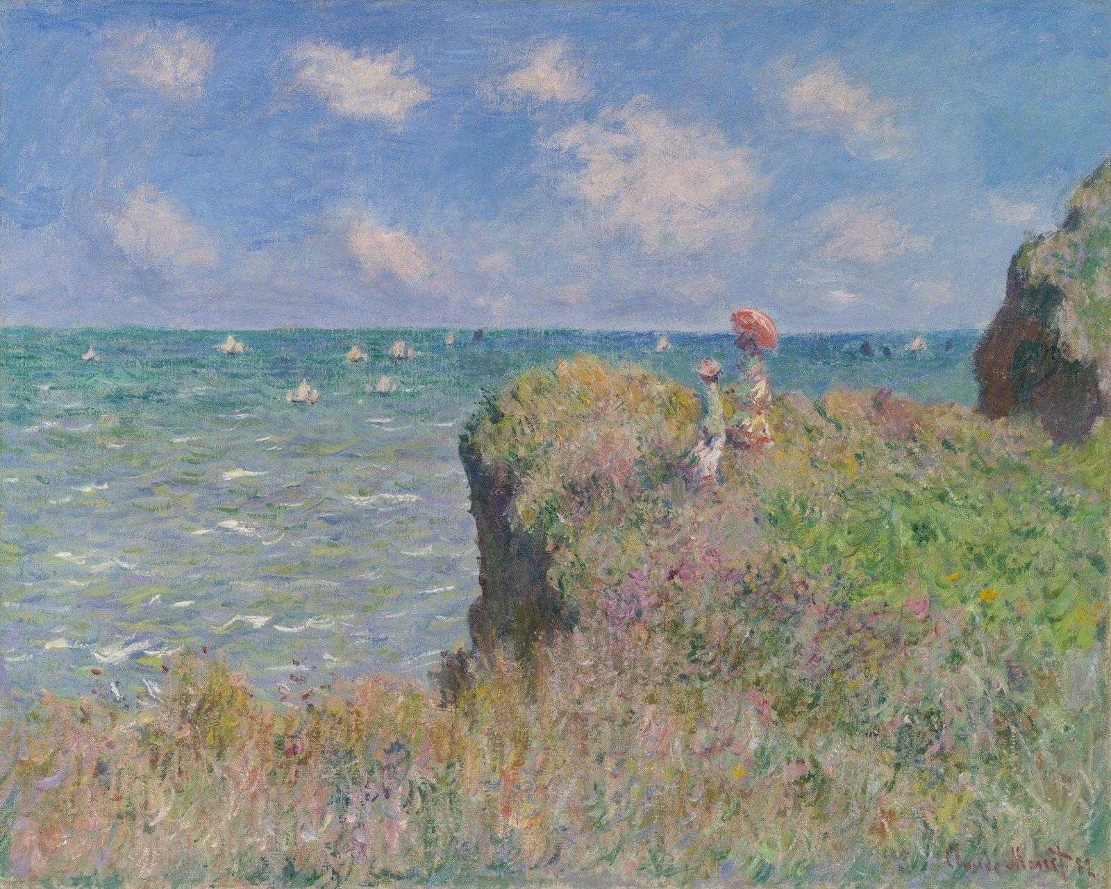
Step back and look at the whole canvas — a woman in pale dress sits on a cliff path with a child beside her, the green-blue sea stretching out below, the cliff face anchoring the right side. Everything here is cool and atmospheric until your eye lands on the parasol, a single saturated orange-red that seems to glow against the muted palette. That one warm note is what Monet built this coastal afternoon around.
Plein-air on the Normandy coast
This is Claude Monet, 1882, oil on canvas — a late nineteenth-century French plein-air landscape, painted outdoors on the Normandy cliffs at Pourville. The soft coastal daylight, the loose brushwork, the unblended edges — these are all hallmarks of Impressionist practice, where the painter works directly from observation, letting the eye do the mixing rather than the brush.
The cliff's diagonal and the sea's horizon
Look at the structural bones of the composition. A strong right-weighted diagonal cuts down from the upper-right corner toward lower-center, where the cliff mass meets the sea; meanwhile, the horizon line of the sea runs almost straight across the left. Your eye enters at the parasol — our focal point at roughly two-thirds across and just below the middle — drops to the pale dress, then traces the cliff edge leftward into the water, and finally lifts along the clouds toward the upper-left corner.
Where the light is coming from
Pan up into the sky. The light is diffuse and slightly from the upper-left — you can see it in the cloud band crossing the upper-center, where the brightest whites cluster along the upper-left contours of the cloud mass, and the underside and right flank carry pinker, slightly muted notes. There are no hard cast shadows anywhere; this is overcast-but-bright marine light, modeled entirely through value and temperature rather than contour.
The parasol and the pale dress
Now drop down to the figures. The parasol is built from short broken strokes of coral, salmon, and pale pink — orange-red keyed higher in saturation than anything else on the canvas. Underneath it, the dress reads as a single pale shape, but it is actually a mosaic of unrelated hues: cool whites, dusty pinks, blue-grays sitting beside one another. The soft edge between parasol and dress is achieved by letting strokes of parasol hue run down into dress territory and vice versa — wet-into-wet, no outline drawn.
Broken color in the foreground grass
Sweep down into the foreground grass. Here is classic broken color: short, multidirectional dabs — some vertical, some diagonal, some nearly horizontal — laid side by side without blending. A yellow dab sits beside a pink one, a green stroke butts against a pale blue, and each mark keeps its own edge. The upper band runs warmer with yellows, ochres, and salmon pinks; the lower band cools into greens, blues, and lilacs. Stand back and your eye mixes all those discrete marks into shimmering grass.
Horizontal flick strokes for water
Move out to the sea. The water surface is built from short, horizontal dashes of paint in roughly parallel arrangement, a blue-grey underlayer showing between the marks and brighter flecks of white and pale yellow-green dropped on top. Each stroke feathers softly into its neighbor — there is no continuous line anywhere, no hard edge, just rhythmic broken flecks whose density and value contrast create the shimmer of moving water. A few cooler, slightly darker notes tucked underneath push some of the brighter flecks forward.
The lost-and-found cliff edge
Now track along the boundary where cliff meets sea — and notice there is no boundary at all. This is a 'lost and found' edge: a cool, hazy zone of pale blue-lavender on the left dissolves into a warm, broken field of olive greens, ochres, and dusty pinks on the right, with no hard line separating them. Tiny warm ochre dabs drift leftward into the cool zone, and cool blue-grey strokes push rightward into the cliff, producing a true optical blend. The edge reads as atmospheric distance because both sides share a narrow mid-value range and limited chroma.
The deepest darks of the canvas
Slide rightward into the cliff's shadowed undercut — this is the deepest value passage in the painting. A vertical band of dark brown and cool grey runs from top to bottom-left, but even here Monet resists filling the shadow with one flat mix. Embedded inside the darks you can pick out warmer reddish-brown notes and stippled comma-like dabs, so the shadow reads atmospheric rather than flat. To its right, the cliff face breaks into warmer umbers and ochres mixed with olive foliage touches.
Sailboats as shorthand
Look far out across the sea and you will find four or five sailboats reduced to almost nothing — a slim pale-cream vertical stroke for the sail and, on a few of them, a single dark navy dab at the foot for the hull. There is no rigging, no mast line, no drawn sail curvature. That is the whole boat. The pale dashes are simply the highest value in the field, and the surrounding broken color of the sea does all the atmospheric work, desaturated cool-warm strokes implying distance without any softening or blur.
A split-complementary scheme
Pull back to the full canvas and look at the color logic. The dominant field is a cool blue-green — sky and sea — set against a single saturated orange-red accent in the parasol and earthy umbers in the cliff and foreground. That is a split-complementary scheme: blue-green's neighbors on the warm side, blue-green's complement in coral, with one tiny bright note doing all the warm work. Temperature-wise, almost the entire painting is cool, and that single warm parasol is what keeps the eye in motion.
Look closer
8 details, each checked against a close-up of the picture.
-
Figures and Parasol
The parasol is rendered with high-saturation orange-red paint contrasting with the pale, loosely defined dress of the figure below.
The crop shows two figures against a teal sea: a standing figure in a straw hat on the left, and a standing figure in a pale cream-pink dress to the right with yellowish-green and rust accents. The parasol above the right figure is built from short, broken strokes of coral, salmon, and pale pink, with the orange-red keyed higher in saturation than anything else on the canvas. The dress is rendered as cool whites, dusty pinks, and blue-grays that read as a single pale shape but are actually a mosaic of unrelated hues. Edges between parasol, dress, and background are soft and intermingled — there is no hard outline, only a shift in value and stroke direction.
-
Foreground Grass Texture
The grass consists of short, multidirectional dabs of yellow, green, and pink paint without blended edges.
The crop shows a dense field of small, short paint dabs layered across the surface, with strokes oriented in multiple directions—some vertical, others diagonal or nearly horizontal. Edges between individual marks remain distinct: a yellow dab sits beside a pink one, and a green stroke butts up against a pale blue without softening into a smooth transition. The upper portion carries warmer yellows, ochres, and salmon pinks, while the lower band is dominated by cooler greens, blues, and lilacs. Layering is visible where a later dab partially covers an earlier stroke, and small dots of white and bright pink sit on top as accents. There is no single blended mass; instead, the eye mixes the discrete marks from a distance.
-
Sea Surface Ripples
The water is composed of horizontal, elongated flecks of white and light green over a darker blue-green base.
The crop is filled with short, horizontal dashes of paint laid in a roughly parallel arrangement. A blue-grey and dull teal underlayer (around #7C95A5) shows between the marks; on top sit brighter flecks of white (#EEF0E8) and pale yellow-green (#A8B89A), with a few muted lavender-grey notes (#8C8AA0) tucked beneath as shadow. Edges are soft and broken — each stroke feathers into its neighbours rather than forming a continuous line, and the weave of the support reads through thinner passages. No hard contours exist; the surface effect of rippling water is built entirely from the density and value contrast of overlapping strokes.
-
Cloud Highlights
The clouds feature bright white highlights on their upper-left edges, indicating a light source from the upper left.
The crop isolates a band of sky with a soft cloud mass drifting across the upper-center. Sky tones shift from a deeper, slightly cooler blue at the top edge to a paler, hazier blue lower down. The cloud is built from broken dabs of off-white, cream, and warm pale peach, with the brightest whites clustered along the upper and upper-left contours of the cloud body; the underside and right flank carry pinker, slightly muted notes that read as the shadow side. There is no hard contour anywhere; edges resolve through adjacent dabs of differing value rather than a single line. The texture reads as small, irregular strokes laid over a wet or tacky blue ground.
-
Cliff-Sea Interface
The edge of the cliff is not a sharp line but a soft, blended transition of earthy tones meeting the blue sea.
The crop captures a vertical interface where a cool, hazy zone of pale blue-lavender and soft greys on the left dissolves into a warm, broken field of olive greens, ochres, and dusty pinks on the right. No hard contour separates the two zones; instead, the boundary is built from intermingled mid-value dabs that carry both temperature families simultaneously. A few brighter pinks and a small orange-red fleck sit just inside the warm side, while the left side is constructed almost entirely from low-contrast, slightly desaturated strokes that read as aerial perspective. Tiny dabs of warm ochre drift leftward into the cool zone, and cool blue-grey strokes push rightward into the cliff, producing a true optical blend rather than a wet-into-wet smear.
-
Cliff Shadow Depth
The deepest values in the painting are located in the shadowed undercut of the cliff using dark brown and grey tones.
The crop centers on the shadowed undercut of a steep cliff face, where the deepest values cluster in a vertical band of dark brown and cool grey running roughly from top to bottom-left. To the right of this shadow, the cliff face breaks into warmer umbers and ochres mixed with olive and yellow-green foliage touches. On the far left, a narrow strip of pale grey-blue and cream washes suggests distant sea or sky glimpsed past the rock. Edges between darks and lights are softened by scumbled, broken brushstrokes rather than hard contours, and the shadow mass shows subtle warmer reddish-brown notes embedded within the cooler grey.
-
Distant Sailboats
The sailboats are represented by small, vertical white dashes of paint without defined rigging or hulls.
The crop isolates a stretch of sea containing four to five tiny sailboats, each reduced to a slim pale-cream vertical stroke (the sail) with, on three of them, a small dark navy or near-black dab at its foot hinting at a hull. Surrounding water is built from short, broken, predominantly horizontal and slightly diagonal strokes in teal, blue-green, deeper navy, plus scattered warmer ochre and lavender accents — no continuous wet edge separates one stroke from the next. The pale dashes read as the highest value in the field; they are not outlined, and no rigging, mast line, or sail curvature is drawn. Atmospheric haze is implied by the desaturated, cool-warm interweaving of stroke colors rather than by any softened blur.
-
Artist Signature
A small, handwritten signature is visible in the lower-right corner in a dark pigment.
The crop is heavily smeared with vertical motion blur, so individual brushstrokes cannot be resolved and edges are unreadable. The upper two-thirds consist of vertical streaks in mid-greens, yellow-greens, and a strong teal band along the right edge. The lower third introduces reddish-brown vertical streaks over a paler ground, with a thin lighter diagonal smear that could correspond to a paint-loaded mark crossing the blur. Lower in the corner the red-brown letters read 'Claude Monet 82', written in one line along the bottom edge.
Cliff Walk at Pourville in context
Two trips to the coast
Monet went to Normandy in February 1882 partly to escape pressures in Paris, where a long economic recession was hurting his sales and he had handed his part in the seventh Impressionist exhibition to his dealer, Paul Durand-Ruel [1]. He found Dieppe too urban, settled in the fishing village of Pourville and stayed until mid-April [1].
He returned from mid-June to early October, this time with Alice Hoschedé and their combined family [2]. The Art Institute's catalogue counts nearly one hundred canvases painted along the Normandy coast that year, placing this view probably at Val Saint-Nicolas, between Pourville and Dieppe [2]. The bright summer sky and the two figures suggest it belongs to the second trip. Still, the catalogue admits that canvases from the two visits are often hard to tell apart [2].
Thinking in pairs
On 25 March 1882 Monet told Durand-Ruel that he didn't want to send new canvases from Pourville until he could see the 'series' together [2]. The catalogue sets this picture beside Edge of the Cliff at Pourville, which shows the same two rocky outcrops but no walkers. It follows Virginia Spate in reading such works as pairs made with and without spectator figures [2]. Which came first is not known [2].
He didn't paint them in a single sitting. In a letter to Alice during the first trip, he wrote that most of his studies had needed ten or twelve sessions, and some twenty [2].
Another picture underneath
Transmitted infrared imaging shows that Monet began a different composition on this canvas, with a horizon almost ten centimetres higher that rises slightly towards the centre [2]. What that first view showed is unclear. The catalogue suggests it may have resembled a cliff seen from above at Varengeville, or a view from the beach [2].
The canvas is a standard no. 25 size and carries the stamp of the Paris colour merchant Vieille and Troisgros, a stamp dating from between 1879 and 1883 [2]. Its threads match those of Monet's Apples and Grapes, also in Chicago, so both were probably cut from the same bolt [2]. Analysis found pigments including cobalt blue, viridian, emerald green, vermilion and red lake [2].
Holiday view or modern sublime?
Robert L. Herbert noted that only four of Monet's 1882 coastal pictures show tourists, all of them two women looking out to sea. He read them as images of bourgeois leisure [2]. Richard Thomson instead stressed the small figures on a shadowed crag as part of a 'modern sublime' [2]. And the catalogue links the high viewpoint, cropped edges and wrapped, parasol-holding figures to prints by Hokusai and Hiroshige that Monet collected [2].
Hayes, Kapferer and Coburn
The painting was shown at Monet's solo exhibition at Durand-Ruel's Paris gallery in March 1883 as Promenade sur la Falaise, lent by a collector named Hayes, and in London from April that year [2]. Hermann Kapferer sold it to Durand-Ruel on 17 July 1888 for 1,200 francs [1]. But the Wildenstein catalogue instead claims Durand-Ruel bought it from Monet in October 1882, which the dealer's archives can't confirm [1].
It was possibly sold to Annie Swan Coburn of Chicago by April 1928, though that sale also can't be confirmed in the Durand-Ruel archives [1]. She died in 1932 and bequeathed it to the Art Institute, where it arrived in 1933 [1].
- Claude Monet, Cliff Walk at Pourville, 1882 (1933.443): object record, description and provenance . Art Institute of Chicago (public API)
- Gloria Groom and Jill Shaw, 'Cat. 19, Cliff Walk at Pourville, 1882', with technical report by Kimberley Muir, in Monet Paintings and Drawings at the Art Institute of Chicago (public API) . Art Institute of Chicago