Reading Hassam's El Zocodover
How an American Impressionist caught the heat of a Spanish plaza
- Artist
- Childe Hassam
- Title
- El Zocodover, Toledo, Spain
- Date
- 1910
- Medium
- Oil on board
- Museum
- Art Institute of Chicago
- Image
- Public domain (CC0)
Open in Simple Art
Watch this story on iPhone and iPad, with offline downloads and a painting every day.
About 6 minutes of looking, in 10 parts.
A plaza alive with light
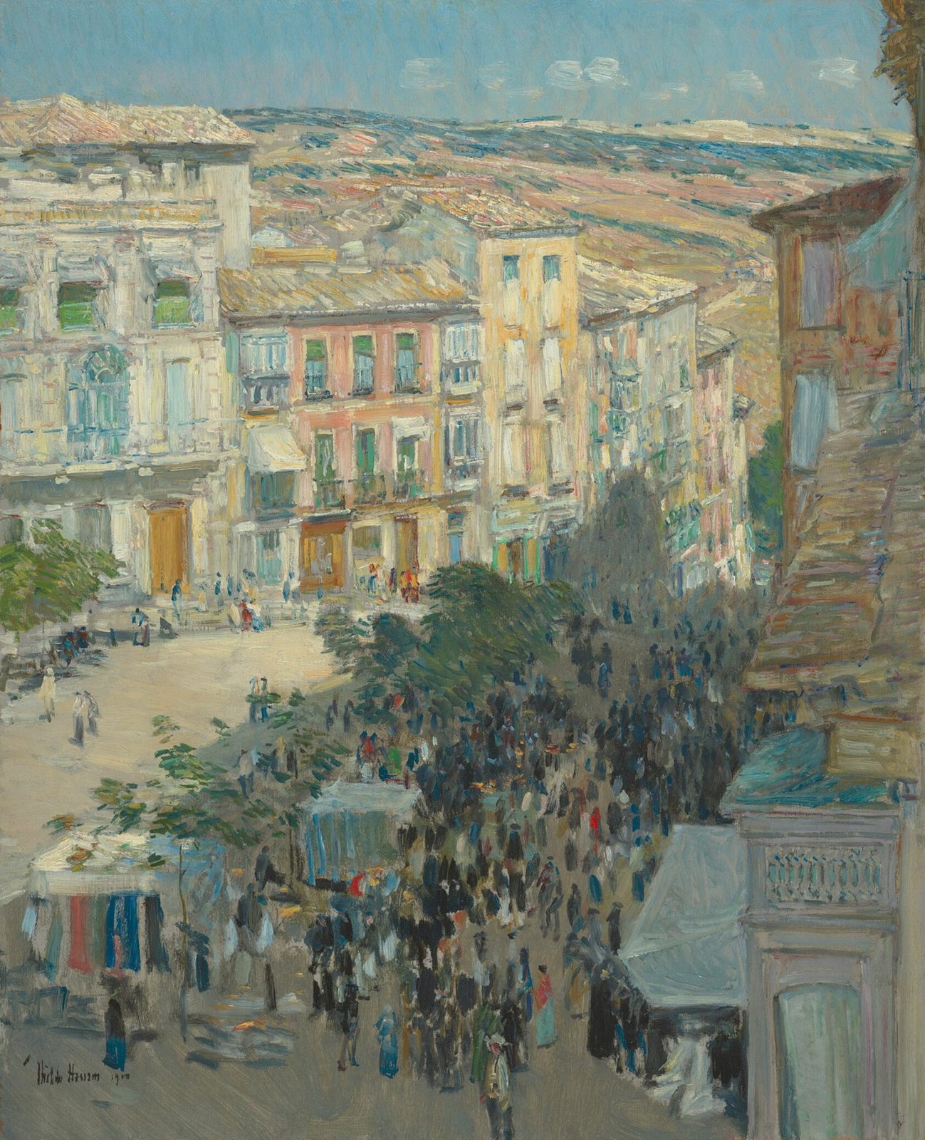
Before you is a square caught in the full blaze of midday, every façade glowing, every shadow sharp. Childe Hassam's 1910 oil captures the Plaza de Zocodover in Toledo, and the camera is about to walk you through exactly how he made that Spanish heat feel real on a board. Notice first how the eye has nowhere to hide: walls pull you down, the crowd pulls you in, and the whole composition seems to hum.
Toledo, 1910
Hassam was an American Impressionist at the height of his career, and he painted this plein air on a small board, working directly from the scene. The cityscape is the subject, but it is also an excuse to chase one thing: the temperature of light falling on warm Spanish stone. Keep that in mind as we move closer, because every brushstroke you'll see is really a note about illumination.
The V-shaped funnel
Step back and look at the structure. Tall buildings on the left and right edges lean inward, forming a wide V that funnels your eye down to the dark knot of the crowd at center-bottom. The horizon sits low, near the upper third, and Hassam uses that rule of thirds deliberately. Watch the diagonals now, from the upper corners sliding toward the plaza floor — they're doing the heavy lifting.
Midday on warm stone
Drift toward the central palace, the brightest slab on the canvas. Here Hassam loads his brush with pale yellow, salmon pink, and off-white, laying them as short overlapping strokes rather than blending them. The sun is high and slightly to the left, so the wall reads almost white-hot while the recessed windows sink into muted greens. This is broken-color, the Impressionist trick: don't mix on the brush, place them as neighbors and let the eye fuse them at distance.
Cool shadow, warm sun
Now slide right into the shadowed architecture. Notice how the right-hand building is painted in cool blues, teals, and muted violets — the opposite temperature from the sunlit center. Hassam sets these complementary hues directly beside each other, and they make each other vibrate: the warm wall pushes forward, the cool façade pulls back, and you feel the depth of a real Spanish afternoon. Look for the turquoise doorway acting as the chromatic hinge between them.
Distant hills in atmosphere
Lift your gaze to the horizon. Those distant hills are not blended smooth — they are built from thick, parallel horizontal strokes of pale cerulean, salmon, and sandy tan laid side by side. Some passages are thin enough that the ground shows through. This is aerial perspective built by juxtaposition: warm notes next to cool notes, left raw, with no soft transitions. The harder you try to blend a horizon, the flatter it gets.
Balconies in broken lines
Push in on the central facade, where the balconies live. Hassam suggests their iron railings with only a few thin, interrupted strokes of dark brown and black laid directly over the warm wall. He is not drawing the railing — he is hinting at it. Notice how the broken marks are more convincing than a continuous line would be, because they keep the shimmering broken-color surface intact.
Market stalls in thick dabs
Drop down to the lower left, where the market stalls sit. A saturated crimson panel, cool teal blues, and pale cream fabrics hang in stacked vertical dabs of thick paint. Highlights along each fold are separate strokes of lighter red and pink laid wet-in-wet over a darker underlayer. The fabrics don't have drawn edges — they simply bleed into one another where complementary strokes meet, and that softness is what makes them read as cloth rather than poster color.
The crowd, suggested not drawn
Settle now on the focal point — that dark mass of figures in the lower center. This is the painting's anchor. Look closely: there are no faces, no hands, no feet. The crowd is built from short vertical dabs of dark navy, umber, and white, with a few warm accents in red and ochre. Where white dabs sit beside the darkest navy marks, that high contrast is what gives the throng its sparkle. Hassam trusted the cluster to read as people without ever drawing one.
Figures as gesture
Move to the foreground figures on the left. Two vertical shapes — one pale cream, one charcoal — stand without a single resolved facial feature. Hassam blocked them in with single vertical strokes, then swept the warm cream background around them wet-into-wet, so the edges stayed soft and broken. When a figure's edge bleeds into its ground like this, it sits inside the light rather than pasted on top of it.
Look closer
7 details, each checked against a close-up of the picture.
-
Central Crowd Mass
Figures are rendered as gestural dabs and short vertical strokes of dark blue, brown, and white.
The crop centers on a dense crowd mass rendered as small, abbreviated vertical dabs clustered tightly across the middle and lower regions. Most figure-marks read as dark blue, deep umber, and white, with scattered warm accents (a red-orange figure near the center, ochre dashes) sitting on a muted olive-grey ground that shows through the interstices. Edges are broken and soft throughout — no figure is outlined, and the tree's foliage above dissolves into the sky with feathery green-grey strokes rather than hard contours. Value contrast is concentrated where white dabs sit next to the darkest navy marks, giving the crowd its sparkle and mass.
-
Sunlit Façade
The wall is composed of overlapping strokes of pale yellow, pink, and white to represent direct midday sunlight.
The crop isolates the central block of a multi-storey façade rendered in short, overlapping strokes of pale yellow, salmon-pink, and off-white laid diagonally and horizontally across the wall plane. The strokes are not blended but sit side by side, with soft, broken edges where pink slips beneath cream and white rides on top of yellow. Three window openings punctuate the wall in vertical rectangles of muted olive and dark teal-green, framed by pale sashes that read as the lightest values on the building. A small iron railing and a striped awning in cream-and-blue appear on the left, while warm ochre and coral passages glow more strongly on the sunlit faces than on the recessed window cavities, which retain a slight green-grey coolness. The marks are visibly loaded with paint and visibly distinct — no area is smoothed into a single hue.
-
Shadowed Architecture
The right-side building uses cool blues and muted purples in its shadowed areas, contrasting with the sunlit center.
The crop captures two adjacent architectural façades separated by a narrow gap, with a stone staircase rising along the lower-right edge. The right building (u≈0.6–0.95) is rendered in cool blues, teals, and muted violets, with thick horizontal strokes of lavender-grey suggesting shuttered recesses and shadow planes. The central block reads in warm ochres, oranges, and pinks, with a bright turquoise-blue doorway panel acting as the chromatic hinge between warm wall and cool interior. Brushwork is loaded and unblended: commas of pigment sit side by side, edges are softened only where complementary strokes meet, and the stair treads are built from short, stepped dabs of pale blue and grey-violet that step down toward the lower-right corner.
-
Market Stall Details
Small, thick dabs of red, blue, and white paint define the fabrics of the market stalls in the lower left.
The crop centers on a cluster of vertical fabric panels hanging in what reads as a market stall. A strong, saturated crimson-red panel sits near center-left, flanked by cooler teal-blue panels to its right and pale cream-white panels to its left. The fabrics are built from short, stacked vertical dabs of thick paint rather than smooth blending, so the highlights along each fold read as separate strokes of lighter red, pink, and orange against the darker red body. To the right, a dark slender tree trunk rises into a loosely massed canopy of olive and slate-green strokes; its silhouette stays soft and broken against the lighter sky tones above. The lower band of the crop descends into muted grey-browns and dull greens where figures and ground are merely suggested with smudged horizontal smears.
-
Foreground Figures
Figures on the left are rendered as loose, vertical shapes without distinct facial features.
Two foreground figures stand as loose vertical masses against a warm cream ground worked with horizontal sweeps. The left figure reads as a tall, pale shape in light cream and soft gray, with a slightly bluer head area suggesting a head covering; the right figure is a darker silhouette in charcoal and umber gray, leaning slightly. No facial features, hands, or feet are resolved—only the suggestive vertical gesture of bodies and the angle of heads. Edges where the figures meet the ground are soft and broken, allowing the cream background to push through. Dark accents cluster at the upper left (deep blue-black) and a small olive-green note sits at the lower right corner, both applied as single loaded strokes.
-
Distant Hills
The horizon line and distant hills are painted with soft, blended horizontal strokes of pale blue and tan.
The crop shows a band of distant landscape painted with thick, broken horizontal strokes rather than smoothly blended passages. I can read distinct notes of pale cerulean blue, salmon-coral, sandy tan, and creamy white laid side by side, with little wet-into-wet smoothing. A vertical white architectural edge anchors the far left, and a peaked roofline with red-ochre tile marks crosses the lower-middle, sitting in front of the hilly band. The paint sits high on the surface, showing palette-knife-like ridges and dry-brush gaps where underpainting shows through.
-
Balcony Elements
The balconies on the central building are represented by thin, dark linear strokes against the pale walls.
A tightly cropped section of a painted building facade reveals heavily textured paint application with visible impasto. Broad, broken strokes of pale peach, yellow, and pink establish the sunlit exterior walls, juxtaposed against rectangular window openings rendered in vertical dabs of muted green and deep, dark hues. The edges throughout the crop are soft and dissolved, relying on the abrupt shifts in color temperature rather than drawn lines to define the architectural forms. In the lower left quadrant, a balcony structure is suggested through thin, interrupted horizontal and vertical marks of dark brown and black paint set against a lighter, cream-colored ground.
El Zocodover, Toledo, Spain in context
A loan with a short record
The Art Institute of Chicago dates the painting to 1910 and records it as oil on board, 65.1 by 52.4 centimetres [1]. It is not owned by the museum: the credit line reads 'Anonymous loan', and the collection record lists no provenance, exhibition history or publication history [1].
Wikidata records a second label for the painting, 'View of a Southern French City' [5]. It doesn't say where that name came from or when it was used. So it may reflect an earlier misidentification of the subject, but the source doesn't confirm this [5].
The square itself
The Plaza de Zocodover was for most of Toledo's history the city's main square, and part of it was designed by Juan de Herrera in the reign of Philip II [4]. Its name comes from the Arabic for 'market of beasts of burden', and it served over the centuries for markets, bullfights and festivities, and also for autos-da-fé and public executions [4]. After a fire destroyed the old square in 1589 a new one was built, and an 1854 project proposed reorganising it as a rectangular arcaded square [4].
Spain in the autumn of 1910
Hassam had seen Spain before. During a two-month study trip with Edmund H. Garrett in the summer of 1883, he passed through Spain among other countries and painted watercolours [3]. In 1910 he and his wife returned to Europe. While in Paris he painted July Fourteenth, Rue Daunou during the Bastille Day celebrations [3].
According to a catalogue entry from the Carmen Thyssen-Bornemisza collection, the couple then travelled through northern Europe and on to Spain, where Hassam painted in Madrid, Toledo, Cordova, Seville and Ronda before sailing home from Gibraltar in late October or early November [2]. He later said he went partly because he had never painted in oil in Spain [2].
The Spanish set
That same entry says the trip's oils, along with pastels and watercolours, went on show at the Montross Galleries in New York the following year [2]. Reviewers found the exhibition uneven, but they praised the six Spanish oils that the press called the 'Spanish set' [2]. Critics described them as simple 'portraits of places', light-filled but restrained in colour, noting that Hassam avoided the romantic Spain of Manet and Gautier and showed no debt to Fortuny or Sorolla [2].
The entry names only two of the six, both views of Ronda. So it isn't clear from this source whether the Zocodover was among them [2].
Looking down on the crowd
The Thyssen entry observes that throughout his life Hassam often chose a vantage point looking down on his subject, whether in Boston, New York, Paris or Spain [2]. The view of the Zocodover fits that habit. Wikipedia notes he was especially prolific between 1910 and 1920, the decade that opened with this trip [3].
His way of building light from separate touches of colour went back more than twenty years. Wikipedia dates the change to his Grand Prix Day pictures of autumn 1887 in Paris, when he began laying on softer, more diffuse colour with freer strokes, close to the French Impressionists [3]. From 1903 his summers at the Old Lyme art colony in Connecticut helped turn its painters from the muted colours of Tonalism towards Impressionism [3].
- Childe Hassam, El Zocodover, Toledo, Spain (79.1972): collection record . Art Institute of Chicago
- Childe Hassam, Plaza de la Merced, Ronda: catalogue entry and expert report . Colección Carmen Thyssen-Bornemisza
- Childe Hassam . Wikipedia
- Plaza de Zocodover, Toledo . Wikipedia
- El Zocodover, Toledo, Spain (Q20266575) . Wikidata