A morning made of air
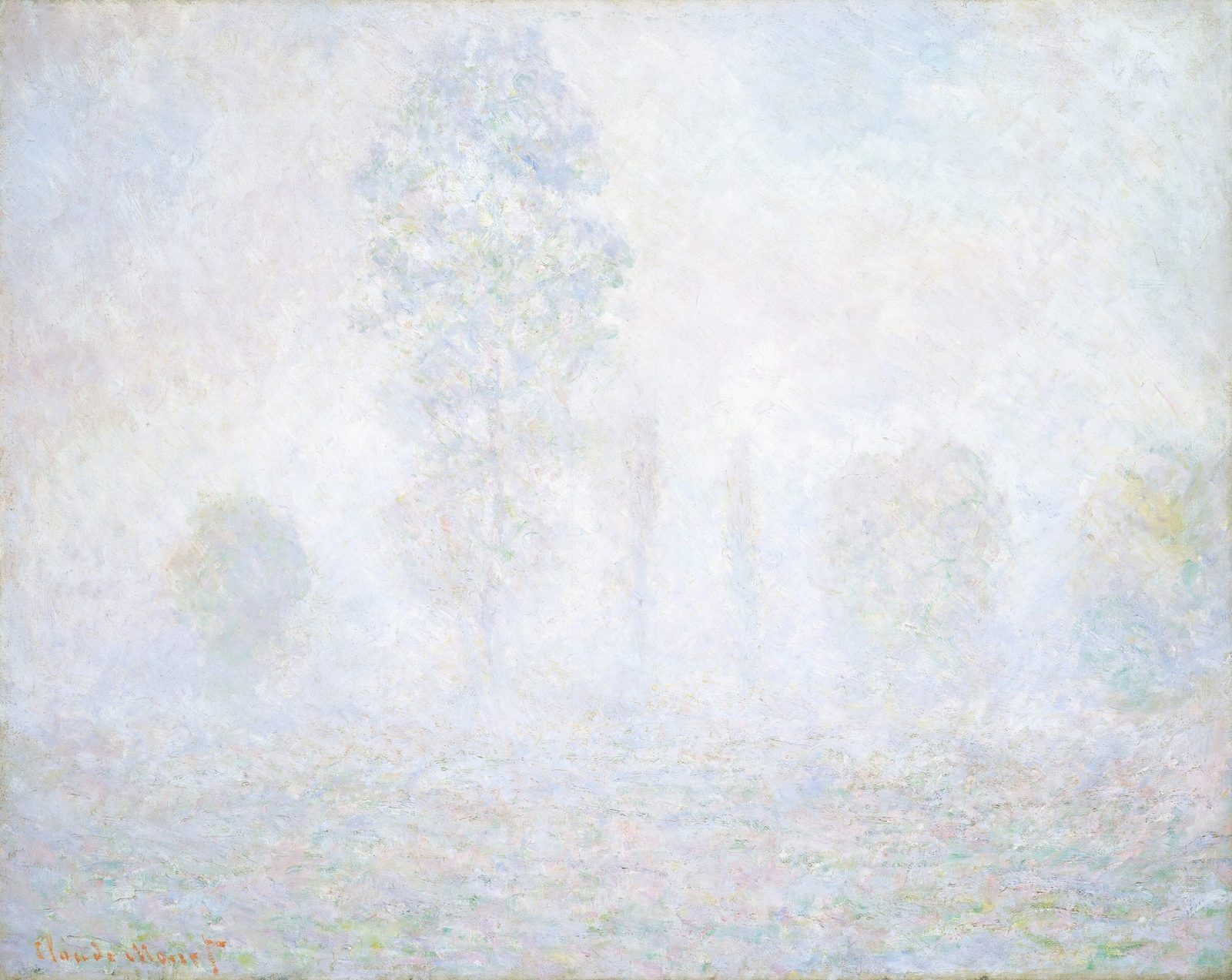
Monet builds a whole landscape from pale scumbles, a faint horizon and two small warm notes
- Artist
- Claude Monet
- Title
- Morning Haze
- Date
- 1888
- Medium
- oil on canvas
- Image
- Public domain (CC0)
Open in Simple Art
Watch this story on iPhone and iPad, with offline downloads and a painting every day.
About 4 minutes of looking, in 9 parts.
Morning Haze
At first there seems to be almost nothing here. A pale, milky field, a slightly denser band near the bottom, and a small red-orange name in the corner. Give it a moment. Soft shapes may start to surface and then sink back, because the haze itself is what you are being asked to look at.
Claude Monet, 1888, oil on canvas
This is Claude Monet's Morning Haze, painted in 1888 in oil on canvas, and now in the National Gallery of Art in Washington. The title tells you the time of day. The picture tells you very little else, and that seems to be the point.
A horizon you have to find
The picture splits into two bands. A paler upper field fills most of the canvas, and a denser strip runs along the bottom, a little over a quarter of the way up. Nobody drew that line. It comes from a change in the strokes, which grow shorter and thicker below it.
Light without shadows
There is no sun to point to and no shadow anywhere. The tones are squeezed so close together that almost everything sits near white. Here at the lower left, a few slightly darker blue-grey strokes make the gentlest step in tone, and that is about as much drama as you get.
Where air meets ground
Move in on the dividing band. Above it, the paint is thin and dry, pale blue, white and lavender feathered into one another. Below, the marks shorten into little horizontals and crosses of green, pink, blue and ochre. Squint, and the horizon appears. Look hard, and it slips away.
One warm patch
Now go to the right edge. Among the cool blue-greys sits a small cluster of yellow-green, slightly thicker and more coloured than anything around it. It has no outline. A shift in temperature is enough to make your eye stop here.
Strokes that suggest a surface
Drop into the lower strip. Short, parallel strokes of pale blue, mauve and white lie side by side, all running across the canvas. It may be water, or perhaps a wet meadow; the painting doesn't settle it. Towards the right, turquoise, rose and pale yellow sit unblended, and from a distance they merge into a soft, glowing neutral.
A dry-brushed veil
Up in the sky, the paint looks as if it was dragged on almost dry, so colour catches only on the raised texture and the paler layer beneath shows through. Drift a little lower and the haze turns out not to be grey at all. Lavender and cerulean strokes sit next to each other, with faint flecks of mint and cream.
The strongest colour is the name
Now the lower left corner. The signature, Claude Monet, is painted in red-orange, the most saturated colour on the canvas, over the pale scumbled ground. In places the strokes thin out, and the cool paint underneath shows through the letters.
Look closer
9 details, each checked against a close-up of the picture.
-
Band division and horizon
A horizontal division near the lower edge of this crop separates thinner, evenly scumbled pale paint above from denser, short directional strokes below.
The crop reads almost entirely as soft, pale atmosphere with a faint horizontal band running across the lower third where a slightly denser, cooler accumulation of paint sits beneath a more thinly scumbled, lighter upper field. Above the implied horizon the marks are broad, dry, and low-contrast, with pale blue, white, lavender, and faint cream passages blending into one another; edges are feathered and no hard contour is visible. Below the band the strokes become shorter and more directional, laid in slight horizontals and short crosses of pale green, pink, blue, and ochre, giving a denser optical texture without ever resolving into defined forms. A small red-orange signature sits in the lower-left corner, the only markedly saturated note in the frame, and its darker warm value helps the eye locate the lower band against the surrounding haze.
-
Right-side warm accent
A concentrated patch of yellow-green pigment sits isolated among cool blue-grey strokes near the right edge.
The crop reads as a near-monochromatic field of pale haze, built from short, broken strokes that leave the woven canvas clearly visible through thin paint. Cool blue-grey and off-white passages dominate, with soft, wet-into-wet edges where warmer creams and lavender-pink whispers are dragged into the surrounding cool. A concentrated cluster of yellow-green pigment gathers in the right-of-center zone, sitting as a slightly thicker, more chromatic mass against the paler background, while a single more saturated green dab appears at the extreme lower right. No hard contours are present, and the overall layering suggests light, scumbled passes rather than opaque coverage.
-
Red-orange signature
The red-orange cursive signature in the lower left sits directly on the pale scumbled ground, its warm hue contrasting the surrounding cool strokes.
The crop centers on a cursive signature rendered in red-orange pigment, reading across the lower third of the frame from left to right. The signature strokes sit on top of a thinly scumbled ground where the canvas weave is plainly visible through gaps in the paint film. Surrounding the lettering, the ground is built from broken, overlapping dabs of pale blue, lavender, pink, mint green, and off-white, with no firm contours. The warm orange of the signature is the most saturated note in the crop and reads as a hard, opaque stroke against the diffuse, low-contrast field. Some downstrokes in the signature thin out and allow the cool ground to show through, giving the letters a slightly broken quality rather than a uniform fill.
-
Lower water-band strokes
Short, parallel horizontal strokes of pale blue, mauve, and white build the lower band without any drawn contour.
The crop shows the lower water-band region composed of short, mostly parallel horizontal strokes layered in pale blue, mauve, pink, and white, with subtle dabs of pale green and yellow-green. Edges between marks are soft and broken, with no drawn outline anywhere; forms emerge only through adjacency of differently tinted strokes. Canvas weave is visible through the thinner passages, and the paint sits at a thin, scumbled thickness in most areas, with occasional slightly raised ridges where heavier pale strokes cross darker underpaint. The value range is extremely narrow, and the overall read is of luminous haze rather than defined water.
-
Upper haze scumble texture
Dry, thinned scumbles leave visible canvas weave and produce a broken, uneven surface in the upper zone.
The crop shows an extremely thin, scumbled application where a cream-toned ground reads as the dominant value across the field. Short, diagonally hatched marks in pale lavender-blue, soft sage, and faint pink overlap without fully covering one another, leaving visible interstices where the lighter substrate shows between strokes. Every stroke edge is broken and irregular rather than crisp, and pigment appears to sit only on the high points of a textured surface rather than filling it. The layering is shallow—each pass barely modifies the value beneath it—so the result reads as a semi-transparent veil of cool and warm notes rather than a fully opaque passage.
-
Cool lavender-cerulean mix
Pale lavender and cerulean strokes intermingle in the upper center, showing the haze is built from distinct cool hues rather than neutral grey.
The crop shows a heavily worked, near-abstract surface where short, broken strokes interlock rather than blend. Cool hues dominate: pale lavender touches sit beside cerulean strokes and faint mint-green flecks, with small warm interruptions of cream, pale yellow, and a single pinkish speck near (0.5, 0.4). Edges between adjacent marks are soft but unblended — each stroke retains its own colour identity, producing a stippled, woven appearance. The upper-right quadrant (around 0.85, 0.15) thins to a near-cream reserve where pigment is barely skimmed, while the left and lower zones (0.0–0.4 horizontally, 0.4–0.9 vertically) carry denser, more saturated lavender-cerulean deposits.
-
Subtle lower-band value shift
Slightly darker blue-grey strokes create the gentlest value modulation within the lower water band.
The crop is an almost abstract field of soft, pale hues with a faintly perceptible horizontal division roughly two-thirds up the frame, where a slightly cooler, blue-tinged lower band sits beneath an even paler, warmer upper expanse. Brushwork is visible as short, scumbled strokes laid in a generally horizontal direction, with individual marks showing clear directional variation—some longer, some dabbed, some dragged. Edges are dissolved rather than crisp; adjacent strokes bleed into one another wet-into-wet, and only the most saturated peach-pink dabs read as discrete marks. The darkest passages are merely mid-value blue-greys that cool the lower band without ever approaching a true shadow, producing the gentlest possible value step.
-
Optical mixing in lower right
Discrete strokes of turquoise, rose, and pale yellow are laid side by side in the lower right water band.
The crop shows a dense field of short, broken brushstrokes laid wet-into-wet with a fair amount of impasto. Individual marks of pale turquoise, soft rose, and light yellow sit side by side without blending on the panel, so the eye optically fuses them into a milky, light-filled neutral. Canvas weave shows through in the thinner passages, and strokes tend to run horizontally in the lower band, suggesting water, while the upper zone grows more vertical and diffuse. Edges are consistently soft and broken; no single stroke is fully resolved.
-
Diffuse pigment accumulation
A loosely defined, slightly denser accumulation of pale pigment floats in the central upper haze.
The crop is overwhelmingly a near-white field interrupted by very low-contrast, short curved strokes of pale pigment. Blues, greens, lavenders, soft pinks and faint yellows are scumbled in broken, overlapping dabs whose edges are softened by the surrounding white ground, so no single mark has a hard contour. A slightly denser, loosely oval cluster of cooler blue-green pigment sits in the upper-centre, and thin vertical smudges below it suggest a faint central axis descending into the lower haze. The cluster and the smudges below it are the crown and trunk of the tall tree, dissolved in fog; value range across the whole crop is roughly 85–97% lightness.
Morning Haze in context
A year between two lights
The National Gallery of Art dates Morning Haze to 1888. But the canvas is signed 'Claude Monet' at the lower left without a date. So the year rests on the Gallery's record and Daniel Wildenstein's catalogue raisonné, where it is number 1196 [1]. The Gallery doesn't say where it was painted [1].
The year itself was split between very different kinds of light [2]. The Courtauld Gallery explains that early in 1888 Monet travelled to the south of France and spent several months painting the intense colours of the Mediterranean, a setting so unlike the north that he feared it would need 'a palette of diamonds and jewels' [2]. Set beside the Courtauld's Antibes picture, with its contrasts of orange and pink against strong greens and blues, Morning Haze, with its whites, pale blues, pinks and lilacs, looks like the opposite extreme [1][2].
Trees in the mist
The Gallery's own description reads the picture as a row of trees emerging from a foggy field [1]. It counts a tall tree just left of centre that nearly reaches the top edge, three shorter, bushier trees about a quarter of its height, and two narrow ones in between, all built from short strokes of white, pale blue, shell pink, lilac and faint yellow [1]. The canvas measures 74 by 92.5 centimetres [1].
Shown in New York as Foggy Morning
The painting was acquired from the artist by James F. Sutton of New York [1]. Sutton was a founder of the American Art Association, where in April 1886 he and Paul Durand-Ruel had staged the first official exhibition of French Impressionism in the United States [3].
In 1891 the picture was shown as number 77, under the title Foggy Morning, at the Union League Club in New York [1]. Claire Hendren describes that show, held from 12 to 14 February 1891, as Monet's first one-man exhibition in the United States, with thirty-four of his paintings hung beside forty-seven Old Masters [3]. Sutton was among the lenders. That year, the club's art committee was chaired by Thomas B. Clarke, a linen businessman turned dealer and adviser [3]. One reviewer in The Art Amateur thought the show put an end to all reasonable doubt about Monet's place in contemporary art [3].
Havemeyer, then Dale
After Sutton's death in 1915, the painting was sold at the American Art Association on 16 January 1917. It was lot 151 in a sale given as the collection of Mrs Florence Macy Sutton [1]. Durand-Ruel bought it there for Louisine Havemeyer, according to an annotated copy of the sale catalogue in the Gallery's files [1]. The Havemeyer collection catalogue of 1931 and the Metropolitan Museum's 1993 exhibition catalogue Splendid Legacy both list it [1].
It was sold again at the American Art Association on 10 April 1930, lot 71, where Chester Dale bought it [1]. Dale lent it to the Wadsworth Atheneum in Hartford in 1933 and to the Philadelphia Museum of Art, which showed his collection from 1943 to 1951 [1]. He gave it to the National Gallery of Art in 1958, during his lifetime, whereas other Monets from his collection, such as Jerusalem Artichoke Flowers, came to the Gallery with his bequest in 1963 [1][4]. In the Gallery's archived record of December 2025 it was listed as not on view [1].
- Claude Monet, Morning Haze (1958.12.1): object record, inscription, provenance, exhibition history and bibliography (Internet Archive copy, 2 December 2025) . National Gallery of Art, Washington
- Claude Monet, Antibes (P.1948.SC.276): collection record . The Courtauld, London (Samuel Courtauld Trust)
- Claire Hendren, 'Impressionist Art in Private Clubs: The Case Study of the Union League Club (1886-1902)', Transatlantica 2 (2017) . Transatlantica / OpenEdition Journals
- Claude Monet, Jerusalem Artichoke Flowers (1963.10.181): object record and provenance (Internet Archive copy, 16 September 2026) . National Gallery of Art, Washington