Two dark openings in a pale façade
In cool, hazy light, Monet holds a whole cathedral front together with a few deep shadows and a play of blue against peach
- Artist
- Claude Monet
- Title
- Rouen Cathedral, West Façade
- Date
- 1894
- Medium
- oil on canvas
- Image
- Public domain (CC0)
Open in Simple Art
Watch this story on iPhone and iPad, with offline downloads and a painting every day.
About 3 minutes of looking, in 9 parts.
Rouen Cathedral, West Façade
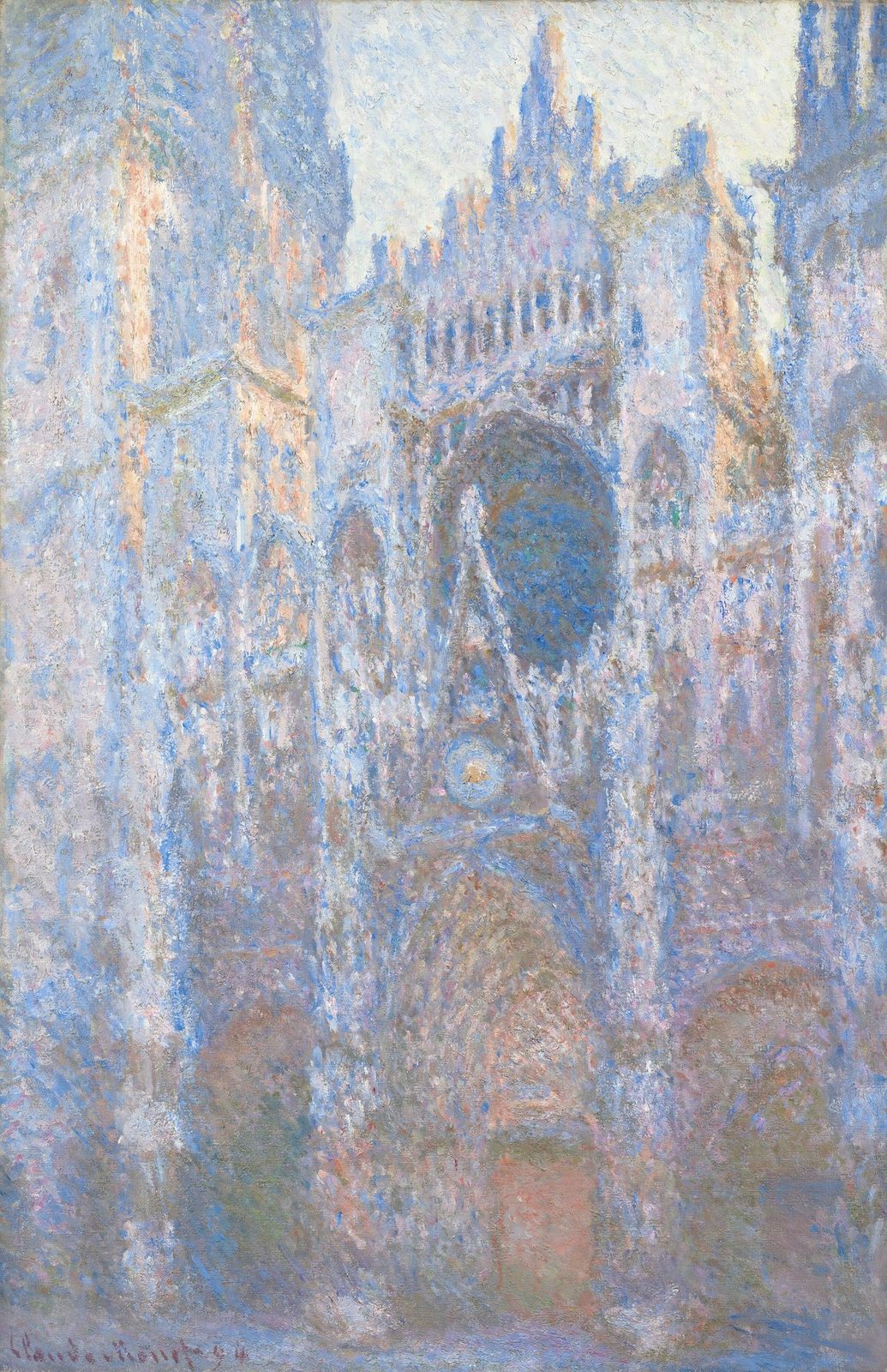
A cathedral front fills the canvas from top to bottom. It is pale, bluish and soft, as though seen through cool air. Only two shapes are really dark, one rounded and one arched, and they are what hold the picture together.
Claude Monet, 1894, oil on canvas
This is Claude Monet's Rouen Cathedral, West Façade, painted in oil on canvas and signed and dated 1894 at the lower left. Almost everything you see is blue, lavender or cream, with warmer peach worked in between.
Two dark anchors
The façade is nearly symmetrical. Follow the centre line down. First comes a large dark opening, which reads like a great window, then a deeper arched recess below it, probably a doorway. Around those two shapes, everything else stays light.
The brightest corner
Look up to the top right. This is the lightest paint on the canvas, thick dabs of cream and pale lavender that seem barely mixed. Just beside them, cooler blues step down the edge of a tower. Light here comes from colour, not from cast shadow.
A dark shape without a rim
Now the dark opening at the centre. Its inside is built from dense strokes of blue-violet and brown-grey, with a few teal flecks. Arcs of blue-violet, ochre and grey circle it, but none of them closes into a ring. The edge exists only where dark meets light.
The second anchor
Drop to the arched recess below. It is a mass of overlapping slate blue, lavender-grey and dove grey strokes, a little darker and denser than the stone around it. That difference in density is all that tells you the wall goes back here.
Warm against cool
Move to the left side. A vertical shaft of peach, salmon and pale orange runs right beside cool ultramarine and periwinkle, and the two never blend. A little lower, tracks of blue and peach side by side suggest the edge of a pier. The building becomes a pattern of temperatures.
A mosaic of flecks
At the top left, raised dabs of white, ultramarine and lavender sit on the surface, each keeping its own colour. Close up, it is a mosaic of flecks. From further away, they fuse into pale, shimmering stone.
Warmth at the base
Down at the base, near the centre, a patch of salmon pink and muted orange breaks into the cool blue-grey. It is the warmest note in the lower half, and it stops the bottom of the picture from going cold.
Look closer
9 details, each checked against a close-up of the picture.
-
Rose-window dark oval
The central dark oval is ringed by concentric strokes of blue-violet, brown-grey, and ochre that never form a continuous contour.
The crop isolates the upper-middle of the facade where a dark rose-window oval dominates the frame. The oval interior is built from dense, broken strokes of dark blue-violet, brown-grey, and small teal flecks, all sitting in heavy impasto. The boundary of the oval is never drawn as a continuous contour: it is implied only by abrupt value shifts where the dark interior meets surrounding high-key strokes of lavender, pale blue, and cream. Concentric arcs of blue-violet, ochre, and brown-grey weave through the oval but constantly fragment and interleave with the surrounding atmosphere, so no ring closes itself. Highlights cluster along the upper-right shoulder (cream and lavender notes), while the lower-left rim sinks into cooler greys.
-
Lower recessed portal arch
The lower recessed arch is a mass of overlapping dark blue and grey scumbled strokes with no drawn outline.
The crop is dominated by thick, broken scumbled strokes in a cool key of slate blue, lavender-grey and dove grey, with small interjections of warm ochre, dusty pink and cream. In the upper-middle a roughly circular cluster of concentric blue and cream dabs reads as the rose window; below it the paint becomes denser and slightly darker, a recess built entirely from overlapping hatched strokes rather than a drawn line. No contour is visible anywhere: the arch silhouette is implied only by the relative darkness and density of scumbled strokes against the surrounding lighter façade. Edges between marks are ragged, leaving the canvas weave and underlying strokes visible in many places, and the impasto catches light on stroke ridges while shadows pool in the troughs between them.
-
Upper-right brightest passage
This area contains the highest-key paint on the canvas: thick, almost unmixed cream and pale-lavender dabs.
The crop is dominated by a near-white sky passage built from short, broken, palette-knife-like dabs of cream, off-white, and pale lavender, with tiny accents of pink and pale blue scattered throughout. On the right edge a dense vertical band of mid- and deep-blue/grey dabs steps inward, marking the dark silhouette of a tower (its edge is not drawn as a line but assembled from juxtaposed cool strokes against the light field). Lower in the crop the key falls rapidly: peach, salmon, terracotta, and olive dabs interlock with cool violets, and individual strokes stay visible and unblended, with canvas weave showing through the thinnest touches in the upper-left. Values are extremely compressed across the whole passage, and there is almost no hard contour anywhere — every shape is read through neighbouring colour temperatures rather than outlines.
-
Left warm peach vertical shaft
Vertical stacks of peach, salmon, and pale orange strokes sit directly beside cool ultramarine neighbours without blending.
A vertical column of warm peach, salmon, and pale orange dabs occupies the centre of the crop, running top-to-bottom with a slightly darker, redder salmon concentration near the upper third. These warm strokes butt directly against a field of cool ultramarine, pale periwinkle, and lavender-cream highlights without any softened gradient between them — the warm/cool boundary reads as a hard, jagged seam of adjacent dashes. Impasto is heavy; individual marks stand proud of the surface, and small touches of dusty pink, ochre, and cool grey-green sit as separate notes on top of the underlayer. A horizontal band of cooler blue crosses the shaft mid-frame, briefly interrupting the warm stack and reinforcing its verticality by contrast.
-
Dissolved left vertical edge
A vertical architectural edge is suggested solely by alternating cool blue and warm peach vertical brushstrokes that never merge.
The crop is dominated by thick, vertical impasto strokes that read more as colored threads than as solid forms. A vertical band running roughly through the center-left alternates between cool sky-blues and warm peach-cream touches; these two families of strokes sit alongside each other but stay distinct, so the implied edge of a column or pilaster is produced by color juxtaposition rather than by a drawn line. Paint is loaded in ridges that catch the light, with thinner scumbled passages in the lower half where the canvas weave shows through gray-violet. No stroke crosses the full height cleanly; every vertical is broken into short overlapping dashes of two or three colors, and edges between zones dissolve into adjacent strokes of similar value.
-
Warm peach passage at base
A concentrated passage of warm salmon-pink and muted orange strokes interrupts the cool blue-grey lower register.
The crop reveals a dense impasto surface where the lower-middle band is dominated by a horizontal sweep of warm salmon, peach, and muted orange strokes. These warm marks sit against a cool surrounding field of pale lavender, powder blue, and grey, with the temperature contrast sharpened by a few isolated cobalt and ultramarine dabs. The brushwork is broken and gestural: individual ridges of paint catch light on their raised edges, while the valleys between strokes show tinted underlayers in deeper rose and olive. Edges are entirely dissolved—adjacent strokes overlap without defining a hard contour, so the warm passage reads as a luminous interval rather than a bounded shape. A small cluster of brighter cream-pink accents sits in the lower-left, slightly cooler white-pink notes perch in the upper right, and the whole region vibrates optically from the complementary tension between the warm core and the cool field.
-
Upper-left scumbled impasto
Individual raised dabs of white, ultramarine, and lavender remain physically unblended on the surface.
The crop is densely worked with raised, individual dabs and short strokes that sit on the surface rather than blending into one another. Cool whites, pale lavenders, and mid-tone ultramarines dominate, with scattered warmer peach-pink accents running vertically near the centre of the frame. Edges between strokes are crisp — each mark keeps its identity, so the eye reads the surface as a mosaic of colour flecks rather than a continuous local tone. The brightest highlights (near-white with a cool grey-lilac cast) cluster toward the right edge and upper margin, while deeper ultramarine and cobalt-blue passages recede behind them, creating a clear figure-ground hierarchy of light against shadow. Vertical streaks of warm pink-ochre cut through the cool field, suggesting a sunlit architectural edge or tower flank catching raking light.
-
Upper fenestration notation
Small vertical dark blue strokes sit between lighter cream strokes in the upper centre with no visible contour enclosing a window shape.
The crop is a heavily impastoed vertical band of broken, high-key strokes where dark cobalt-blue dabs sit side-by-side with cream and pale lavender marks, particularly in the upper-middle region around (x≈0.50, y≈0.20–0.30). No continuous contour is drawn: there is no closed rectangular, arched, or circular outline that would frame a fenestration shape — the rose-window reading depends on the local density of blue against cream, not on any hard edge. Lower in the crop the marks shift toward lavender and rose-pink mixed with grey-blue, and a few warmer orange-ochre touches appear at upper-right and upper-left, reading as raking light catching projecting stone. Verticality is the dominant stroke direction everywhere; horizontal or diagonal strokes are rare.
-
Signature and date
Dark red-brown painted letters reading 'Claude Monet 94' are visible over scumbled grey-blue paint in the lower left.
A dark red-brown signature reading 'Claude Monet 94' runs horizontally across the lower portion of the crop, roughly between y=0.55 and y=0.85. The letters are formed by short, loaded, slightly tapered strokes with irregular widths; some ascenders lean right, the 'C' opens to the right, and the '9' and '4' at the end are connected by a thin tail. The signature sits atop a heavily textured field of scumbled grey-blue, lavender, and pale cream dabs with visible vertical streaking above the text and a patch of greenish-grey in the upper right. Edges between signature and ground are crisp in places (where wet paint sat on dry scumble) and slightly feathered elsewhere, suggesting the paint was applied in one pass over a semi-dry surface.
Rouen Cathedral, West Façade in context
From single views to series
The National Gallery of Art explains that by the mid-1880s several artists had grown dissatisfied with impressionism, and Monet began to paint in series, groups of works of almost identical subjects [1]. In the Gallery's account the series broke with impressionism in two ways: the canvases were usually reworked extensively in the studio, and the motif mattered less than the effects of light and weather [1].
The Musée de l'Orangerie groups the Cathedrals with the Haystacks and the Poplars as the 1890s series where Monet seemed almost to dissect time [6]. The Gallery calls the Rouen pictures the most concentrated expression of this idea, with the stone façade filling each canvas [1].
Two campaigns at a window
According to the Gallery, Monet rented rooms opposite the cathedral in late January or early February 1892. He stayed until spring, painting the façade close up and cropped at the sides, as seen here [1]. The Musée Marmottan Monet says he used two apartments facing the building, working at the window from February to April in two successive years [3]. In a letter to Alice dated 18 March 1892 he said he was working like a slave, on nine canvases that day, and that Rouen was wonderful [3].
Rouen's tourist office adds that the first canvases from February 1892 show the Cour d'Albane. They are the only ones made outdoors. After that, he painted the west front from three different vantage points around the square [4]. One was the second floor of the Bureau des Finances, which was a lingerie shop then and houses the tourist office now [4]. This source says he only stepped inside the cathedral after finishing the series [4].
Finished at Giverny, dated 1894
The Metropolitan Museum of Art says Monet finished the cathedral pictures in his studio at Giverny, adjusting each one both on its own terms and in relation to the others, which is why most are signed and dated 1894 [2]. This canvas is inscribed 'Claude Monet 94' at the lower left [1]. The Gallery's commentary goes further, noting that Monet kept up the myth that he painted directly from the motif, although these pictures were certainly finished in the studio [1].
Counts of the series differ. The Gallery speaks of 30 surviving cathedral paintings, the Met notes more than thirty views, and the Rouen tourist office counts twenty-eight canvases [1][2][4]. Monet's own aim, as quoted by the Gallery, was to reproduce 'what exists between the motif and me' [1].
Paris in 1895, New York in 1896
This canvas was one of the twenty cathedrals Monet showed at Galerie Durand-Ruel in Paris in 1895, listed as number 20 [1]. The Gallery records that it then went from the artist to James F. Sutton of New York. They list it with an uncertain catalogue number in the 1896 exhibition 'Marvelous Paintings of Cathedral Rouen by Claude Monet' at the American Art Galleries [1]. Sutton was a founder of the American Art Association. He had helped bring the first official French Impressionist exhibition to New York in 1886 and lent to Monet's first one-man show in the United States in 1891 [5].
After Sutton's death in 1915 the picture passed to his widow and was sold at the American Art Association on 26 October 1933, lot 58, to Wilbur L. Cummings of Greenwich, Connecticut [1]. Cummings sold it to Chester Dale in 1935, and Dale's bequest brought it to the Gallery in 1963 [1]. The Gallery's commentary points out that Monet never insisted that a series be sold together [1].
Two pictures confused
The Gallery owns a second view of the same front, Rouen Cathedral, West Façade, Sunlight. The two have been mixed up in print [1]. The catalogue for the Gallery's 1980 exhibition on Post-Impressionism showed the sunlit picture in place of this one. And their 1985 illustrated catalogue swapped the images, printing each reproduction with the other's entry [1]. The archived record of November 2025 places this one in Gallery 80 of the West Building. Its audio commentary contrasts a brighter view with a darker one painted as the light was fading, which appears to be this picture [1].
- Claude Monet, Rouen Cathedral, West Façade (1963.10.49): object record, overview, audio commentary, provenance, exhibition history and bibliography (Internet Archive copy, 27 November 2025) . National Gallery of Art, Washington
- Claude Monet, Rouen Cathedral: The Portal (Sunlight) (30.95.250): object record (Internet Archive copy, 13 June 2026) . The Metropolitan Museum of Art, New York
- Claude Monet, Cathédrale de Rouen, effet de soleil, fin de journée: collection notice . Musée Marmottan Monet, Paris
- Monet and his cathedrals . Rouen Normandie Tourisme & Congrès
- Claire Hendren, 'Impressionist Art in Private Clubs: The Case Study of the Union League Club (1886-1902)', Transatlantica 2 (2017) . Transatlantica / OpenEdition Journals
- Monet, painting time (exhibition, 2026) . Musée de l'Orangerie, Paris